

01
Project Details
ROLES
Design Research
Physical Computing
Strategic Planning
Usability Testing
UX/UI Design
TOOLS
Adobe XD
Arduino
HTML&CSS
JavaScript
Processing
COLLABORATORS
None
02
Problem
PROBLEM
When faced with an emergency, an astounding 70% of trained first aiders fail to respond. When asked why, many cite a lack of confidence in their CPR skills. As a first aid instructor, I see the disconnect between the theoretical knowledge provided during training and the practical application of skills needed to successfully respond in an emergency. In the case of CPR, bridging this gap could literally mean the difference between life and death.
GOAL
To enhance first aid training by providing a realistic and scenario-based training platform, complete with specific, constructive feedback.
03
Solution
SOLUTION
An interactive CPR manikin and accompanying interface that allow first aid candidates to practise and evaluate their own CPR skills in a hands-on and scenario-based way and to receive detailed visual feedback.

Interactive manikin and accompanying interface
STRATEGIC DESIGN
Backed by research at every step, RALF’s strategic design ensures its viability and effectiveness as a real product.
Video explaining the product's concept and features
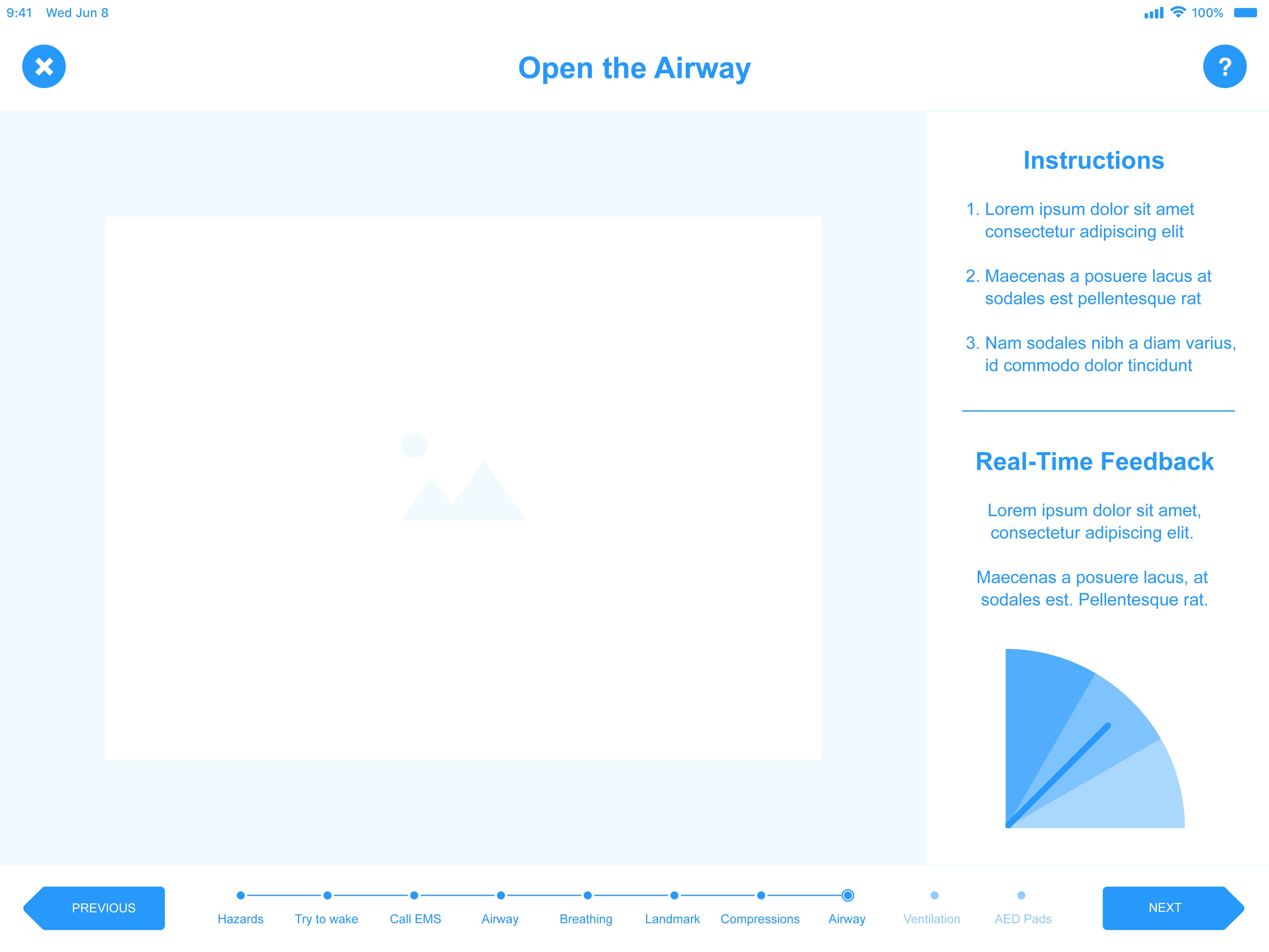
INTUITIVE INTERFACE
RALF’s intuitive interface seamlessly blends the digital and physical experiences to fully immerse users in the learning environment.
GIF showing some of the app's interface
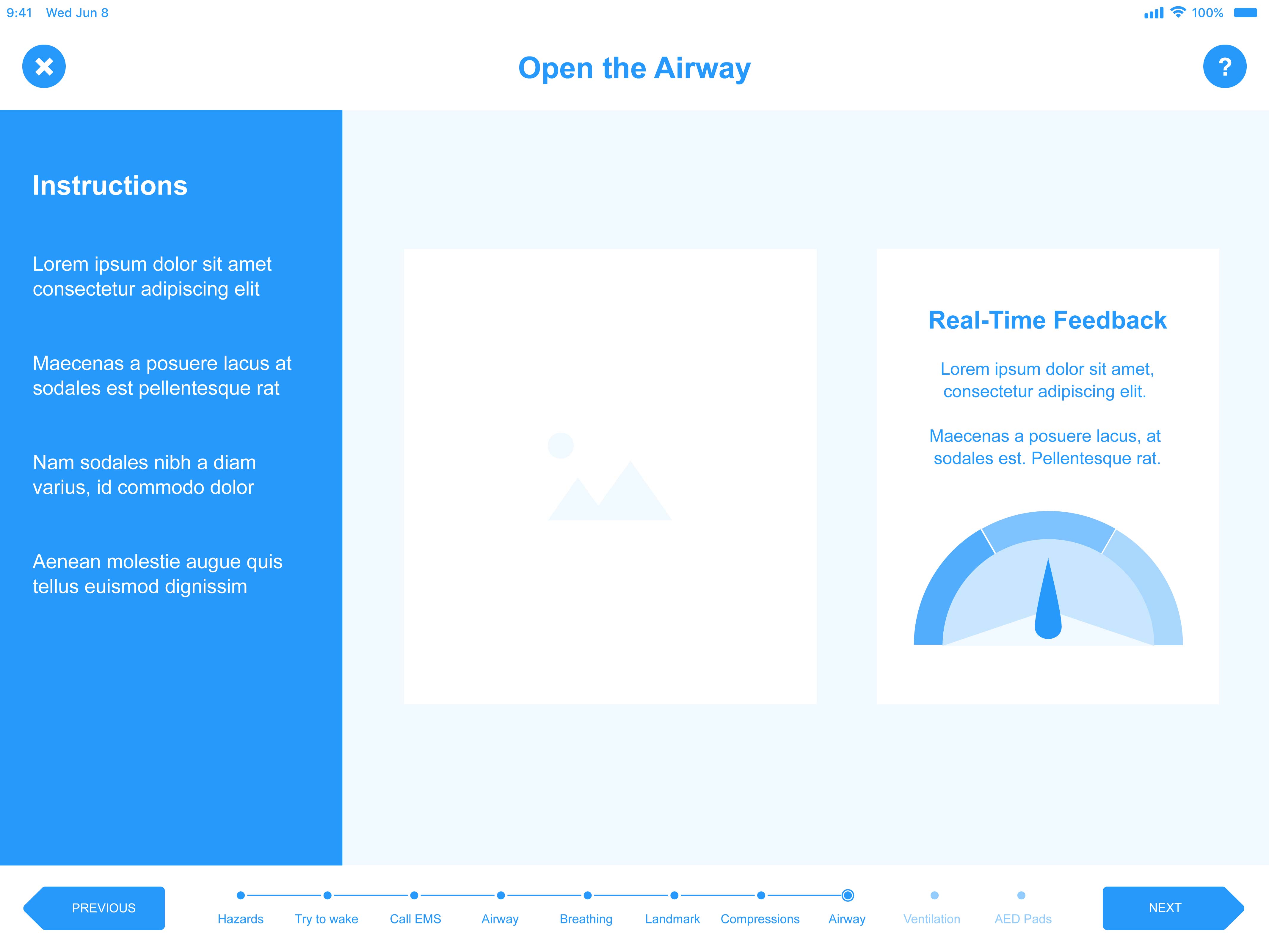
LIVE FEEDBACK
Easy-to-understand visuals provide users with robust feedback on the effectiveness of their CPR performance in real time.
Video demonstration of the interactive manikin and interface
04
Process
RESEARCH GOALS
To better understand the problem space surrounding first aid and first aid education, I conducted both primary and secondary research. The goals of this research were:
To confirm the importance of first aid as a lifesaving measure
To discover whether my perceived problem space had any researched or scientific backing
To understand factors that play a role in first aider competence
To explore peoples' unique experiences with first aid education
To gain insight into potential requirements for a design to enhance first aid education
SECONDARY
RESEARCH
My secondary research confirmed the importance of first aid, and also the relative inability of first aiders to apply their skills in real-life emergency situations. Through this research, I also uncovered three main factors that seemed to contribute to this inability: (1) candidate disinterest in first aid education, (2) deterioration of first aid skills over time, and (3) teaching methods used in first aid education. Based on this research, it seemed that any design with the goal of enhancing first aid education should:
Be engaging, to increase interest in first aid
Encourage the regular practice of first aid skills, to combat deterioration of those skills
Make use of multimedia that engages candidates in creative, exploratory activities
Foster active learning, rather than passive, lecture-style learning
PRIMARY
RESEARCH
Based on my secondary research, and in order to narrow my focus, I wanted to further explore the factors impacting effectiveness of first aid. I also sought to gain a more intimate understanding of first aid education by exploring peoples’ unique and personal experiences with that education.Specifically, I aimed to gain greater insight on the following factors and the ways in which they impact first aider confidence:
Candidate (dis)interest in first aid
Deterioration of first aid skills over time
Teaching methods used in first aid education
To do this, I conducted a self-report questionnaire that collected responses from 70 people who are or once were certified in Standard First Aid. I also conducted three interviews with first aiders and first aid instructors.
This research confirmed some of my earlier findings from my secondary research. It also allowed me to narrow down the scope of the project. In addition to the points listed above, based on this research, it seemed that any design with the goal of enhancing first aid education should use a combination of teaching methods, including use of technology, hands-on application of skills, and scenario-based simulation.

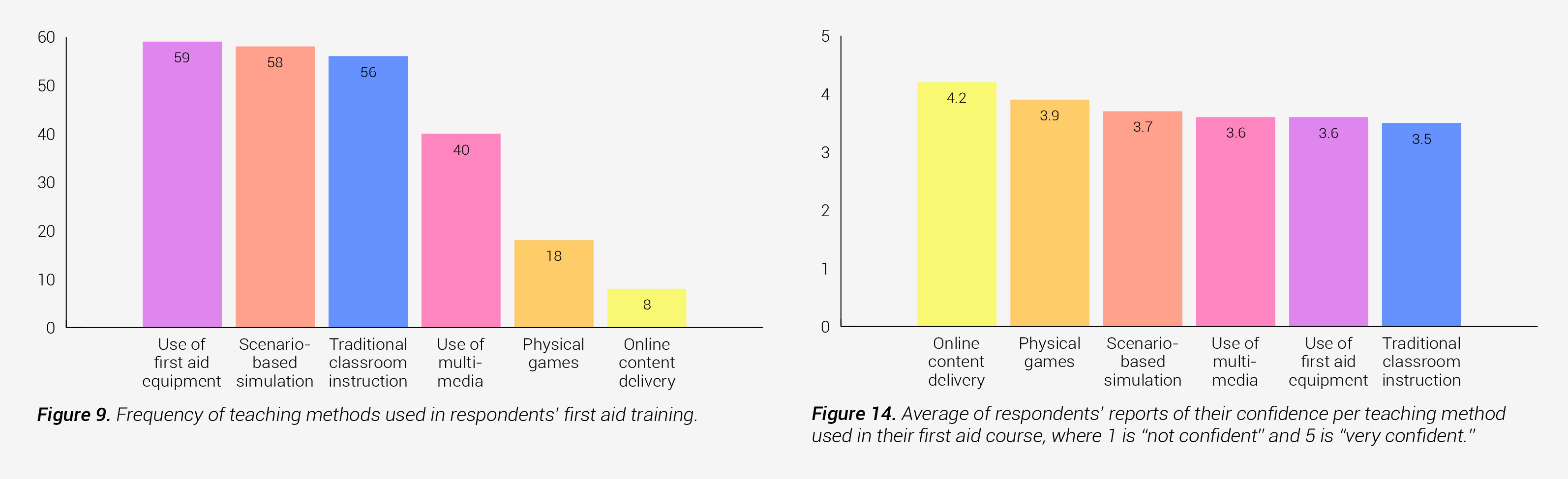
Some charts displaying the results of my primary research on the relationships of interest and teaching methods to first aiders' reported confidence
COMPETITIVE
ANALYSIS
To validate my project’s form and function in comparison to existing products, I conducted a competitive analysis. The competitive analysis allowed me to assess my competitors’ strengths and weaknesses and to understand how RALF could differentiate itself from the competition. The table below compares RALF to four similar products in terms of functionality, usability, and (in some cases) price.

Competitive analysis comparing my thesis concept to existing products in the marketplace
From this analysis I found that, while the competing products do include many of the relevant functions, no existing product includes all the features present in my prototype. Additionally, those products for which I was able to find prices come at very high prices, limiting their accessibility to the general public. Although my product did not yet have an estimated price, I was able to confidently assume that it would not be nearly as high as that of its competitors due to the relatively low cost of materials. This competitive analysis confirmed that my product should be able to compete effectively with similar existing products.
TARGET USERS
While this type of CPR training tool could be useful to a variety of first aiders, such as paramedics, healthcare practitioners, and lifeguards, the majority of people don’t work in these few professions. Instead, I decided to target this product to a larger audience – those certified in more basic levels of first aid, such as Emergency and Standard First Aid.
Because of this group’s large population, its members are the most likely ones to be present at an out-of-hospital emergency. These users are also less likely than professional first aiders to practise their CPR skills on a regular basis, making them the ones who require more substantial training and practice mechanisms.
Additionally, designing for the most general and simple use case affords an opportunity for my design to be scaled in the future. For example, the design could easily be adapted to assist in specialized automated external defibrillator (AED) training, advanced airway management, or even simpler anaphylaxis rescuer courses.
PLANNING THE
PROTOTYPE
While I was able to procure a standard pre-fabricated manikin, it was up to me alone to augment the manikin to allow it to function in the way I envisioned.To begin understanding how I would get the manikin to work, I first considered the elements of CPR and conducted research into the elements that could be detected and for which feedback would be useful. The four elements that I chose to focus on were: (1) opening the airway, (2) performing chest compressions, (3) placing AED pads, and (4) providing ventilation. I then performed research to find sensors that would be capable of detecting each of these actions.

System map showing how I planned for each of the technical elements of the project to interact with one another
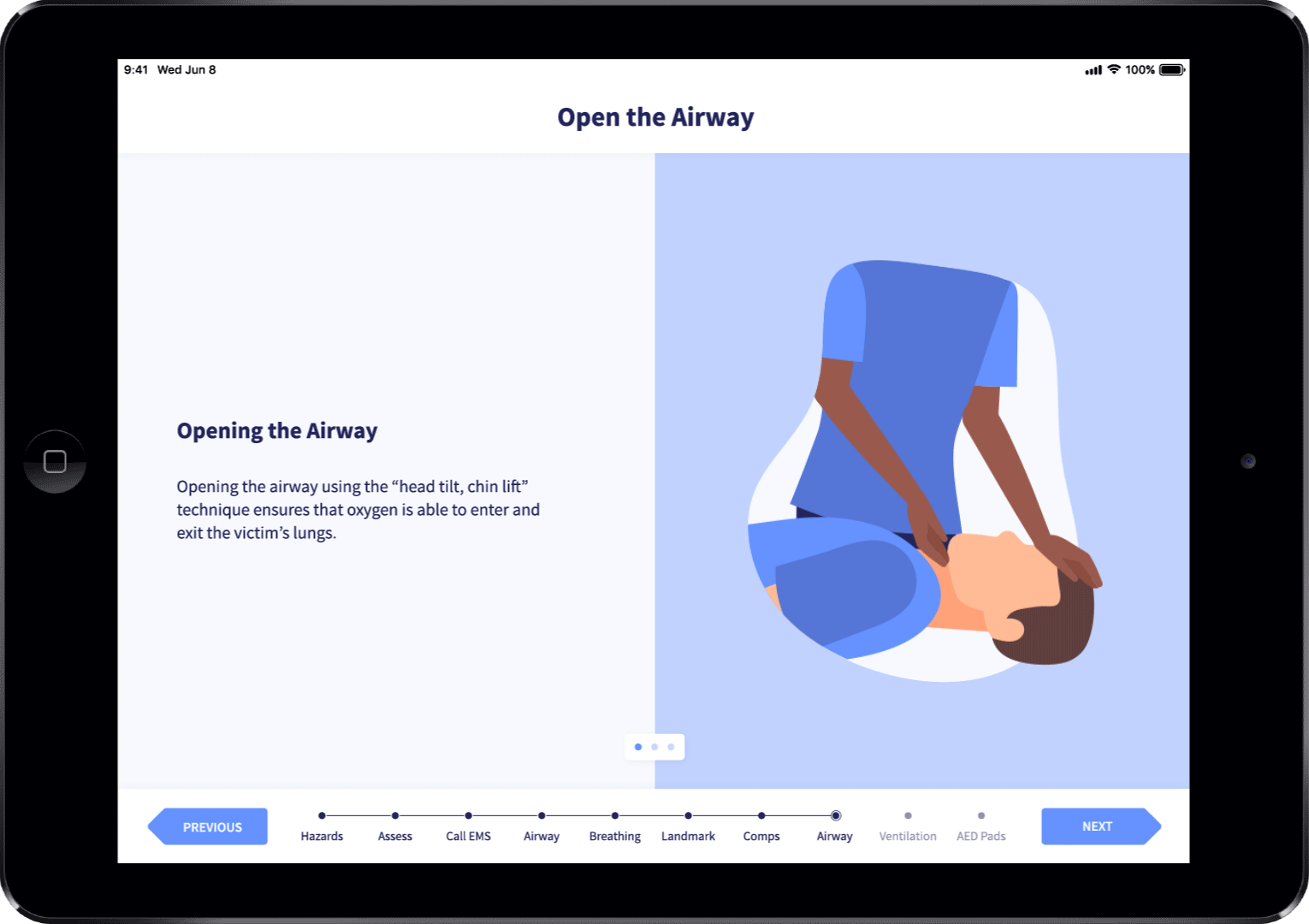
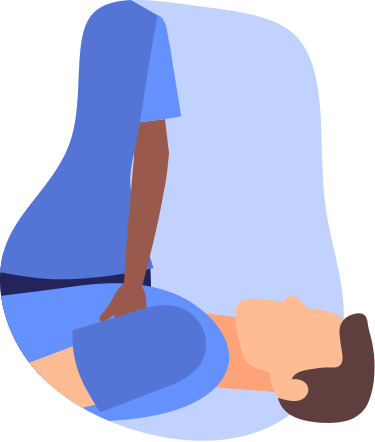
DETECTING
AIRWAY
OPENNESS
To detect airway openness, I mounted one end of a flex sensor to the manikin’s neck and the other end to the inside of its head. This allowed the sensor to bend when the manikin’s head was tilted forward, and straighten out when the manikin’s head was tilted back, and therefore output different values based on the manikin’s head tilt.

Flex sensor used to detect airway openness
Based on this functionality, I was able to write a simple “if” statement to check whether the flex sensor’s value is above or below a certain threshold. This would indicate whether the manikin’s head has been tilted (and airway opened) sufficiently.
if (flexAngle > 200) {
Serial.println("AIRWAY OPEN");
}
Simple "if" statement used to check whether the airway is open
Since there is no scientifically-backed value inCPR guidelines for the angle to which the head should be tilted for optimal airway openness, I decided to be conservative and to set the flex sensor’s threshold to a slightly greater angle than is probably necessary. I did this intentionally to train first aiders through a method known as overcorrection. Overcorrection uses extreme adjustments to make corrections that help the learner get to a point where their performance of the learned skill is accurate.
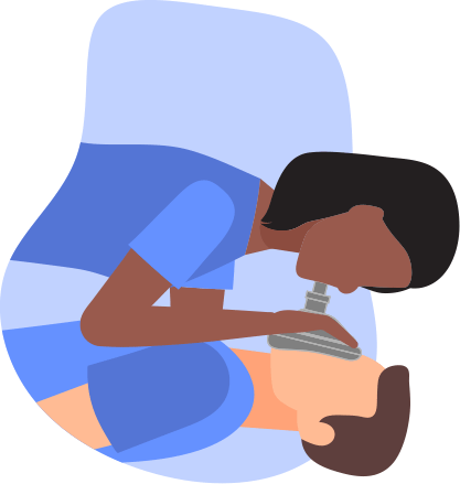
DETECTING
CHEST
COMPRESSIONS
As I began to prototype with the accelerometer, which I had planned to use to detect chest compressions, I ran into a number of challenges. I realized that, while with enough trial-and-error testing, I could find the acceleration values that corresponded to an effective compression, this wouldn’t be the most efficient, direct, or reliable way to accomplish my goals. Additionally, once I received the pre-fabricated manikin, I found that the accelerometer would likely be unable to withstand the force of compressions once it is installed in the manikin, due to the manikin’s construction. After additional research into the science of chest compressions, I found that I could quantify effective compressions not only through depth, but also through force. I then began to prototype with a force sensitive resistor (FSR).
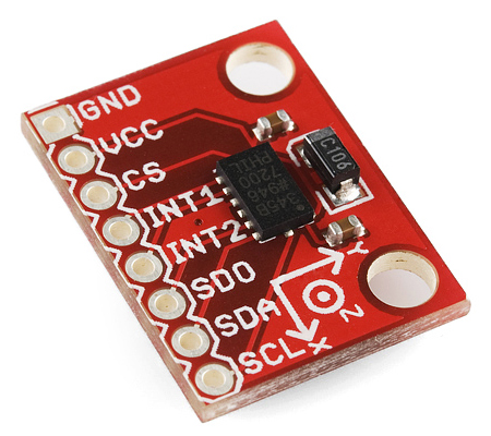
Accelerometer (left) and force sensitive resistor (right)
However, once I embedded the FSR into the manikin, I discovered that its values were no longer reflecting the true amount of force being used, due to the distribution of force within the manikin. To overcome this, I calibrated the sensor by putting the manikin on a bathroom scale and comparing the amount of force being applied (the weight detected by the bathroom scale) to the value outputted by the FSR.

Table showing values outputted by the FSR compared to different amounts of pressure applied and read on the bathroom scale
Based on this testing, I was able to determine that an FSR value ofapproximately 6000 corresponded to 100 lbs. of force applied to the manikin,quantifying one successful compression. To calculate compression rate, I wrotean equation that would calculate a rolling instantaneous average of the lastfive compressions performed. This would allow the user to see whether theircompression rate was effective or not at any moment and to adjust it asnecessary.
compression rate = 60 * (n / (Array[0] - Array[4]))
Rolling instantaneous compression rate equation (written in pseudo-code)
DETECTING
AED PAD
PLACEMENT
To detect the placement of AED pads, I used two hall effect sensors, which detect the presence of a magnetic field. Embedding a strong magnet in each of the AED pads allowed their presence near the hall effect sensors to alter the values outputted by the sensors. Thus, I was able to detect when an AED pad was nearby, based on the hall effect sensors’ outputted values, and I wrote a simple “if” statement to check whether the hall effect sensors’ values were above or below a certain threshold. This would indicate whether the AED pads were in place or not.
if (hallValue > 500) {
Serial.println("AED PAD DETECTED");
}
Simple "if" statement used to check whether an AED pad is detected
In the use of an AED, it is very important that the two AED pads not be mixed up, as their incorrect placement can result in fatality. To help train first aiders to be cognizant of this, I embedded the magnets with opposite polarities in each of the AED pads. This allowed each of the hall effect sensors to detect only the correct AED pad for its location.
DETECTING
VENTILATION
VOLUME
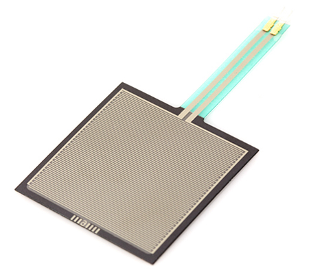
To detect ventilation volume, I decided to use a liquid flow meter. However, because this type of sensor is designed to measure a constant flow of liquid, and I was using it to measure an intermittent flow of air, I ran into some challenges.
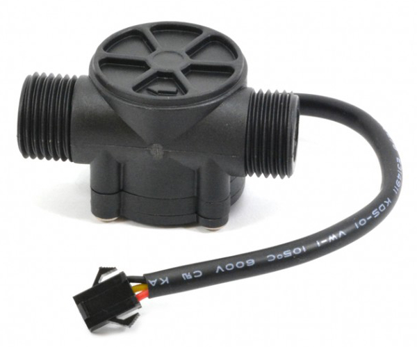
Liquid flow meter used to measure ventilation volume
One major problem was that, because of the force of the air, the turbine in the liquid flow meter would continue to spin even after the air flow would stop, resulting in the over-calculation of air volume. I was able to overcome this by programming a timer to calculate air volume for only a set duration after the start of air flow. According to CPR standards, provision of ventilation should last about three seconds, so I set the timer duration to three seconds. This modification not only solved the bug I had encountered, but it also resulted in enhanced functionality of the manikin: It allowed the manikin to not only train first aiders to provide the correct ventilation volume, but also to provide ventilation over the correct duration, an aspect of CPR that I had not originally planned to include.
PUTTING IT
ALL TOGETHER
Once each of the individual components was functioning correctly, I combined the code from each sensor into one sketch. I also wired all the sensors into one circuit to ensure that each piece of the new combined code was working and that there were no conflicts.
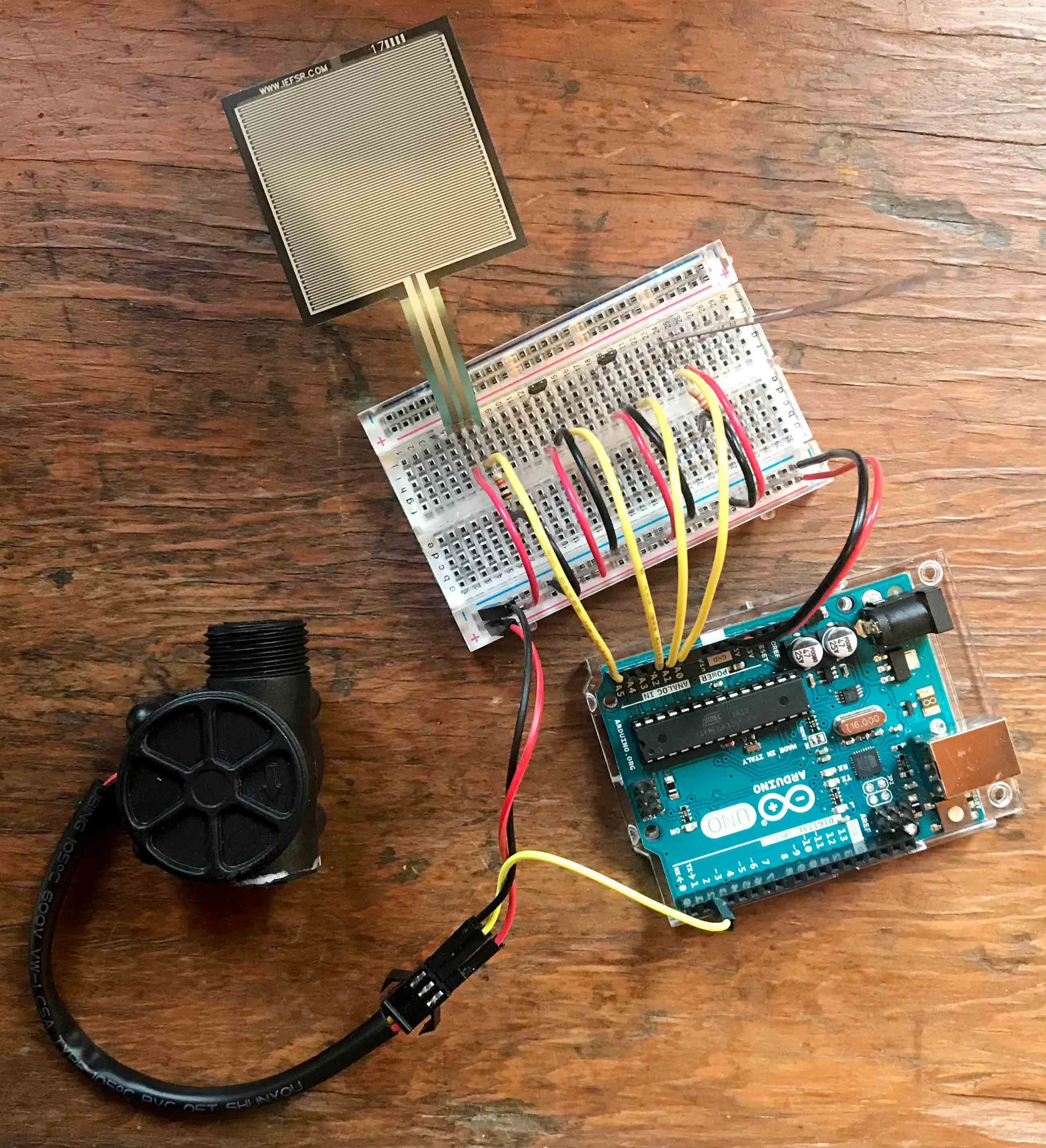
Full circuit wired on a breadboard
Once I confirmed that everything worked, I embedded the sensors into the manikin and secured everything in place with electrical tape.
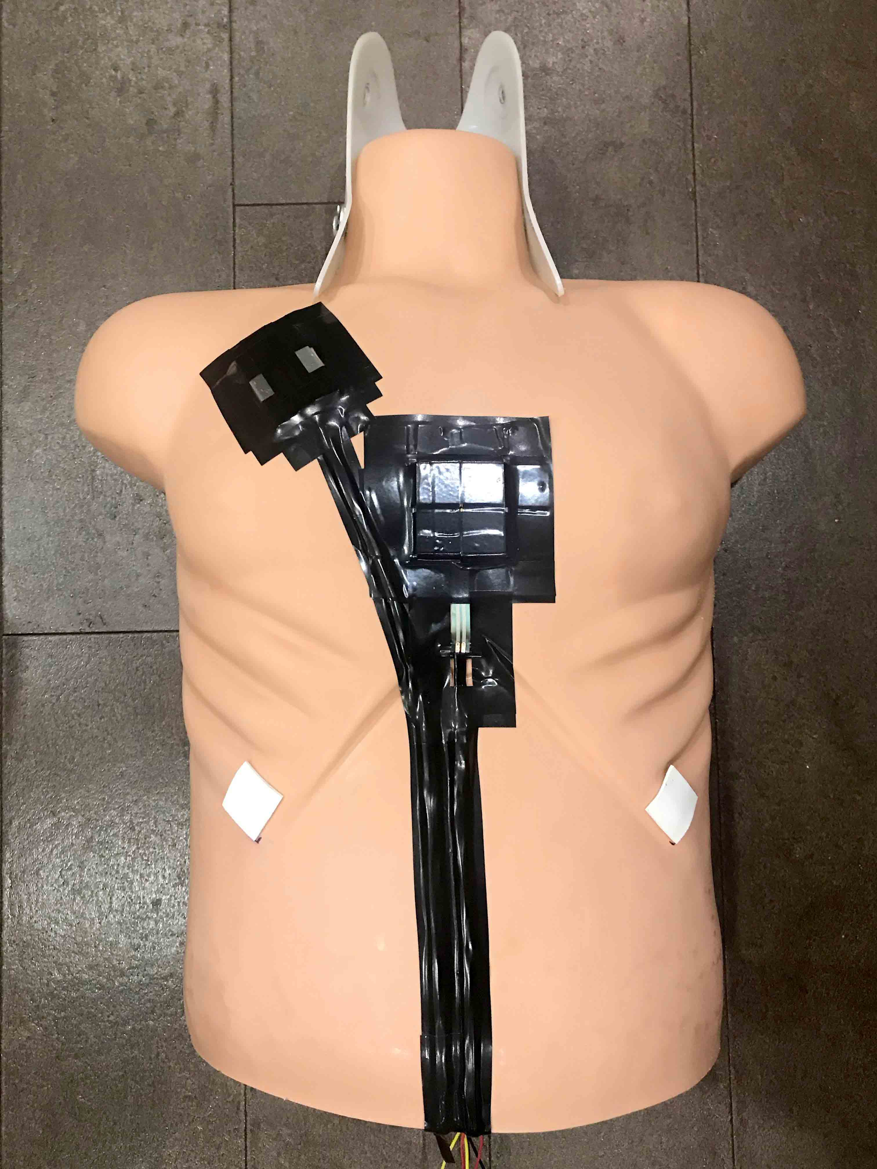

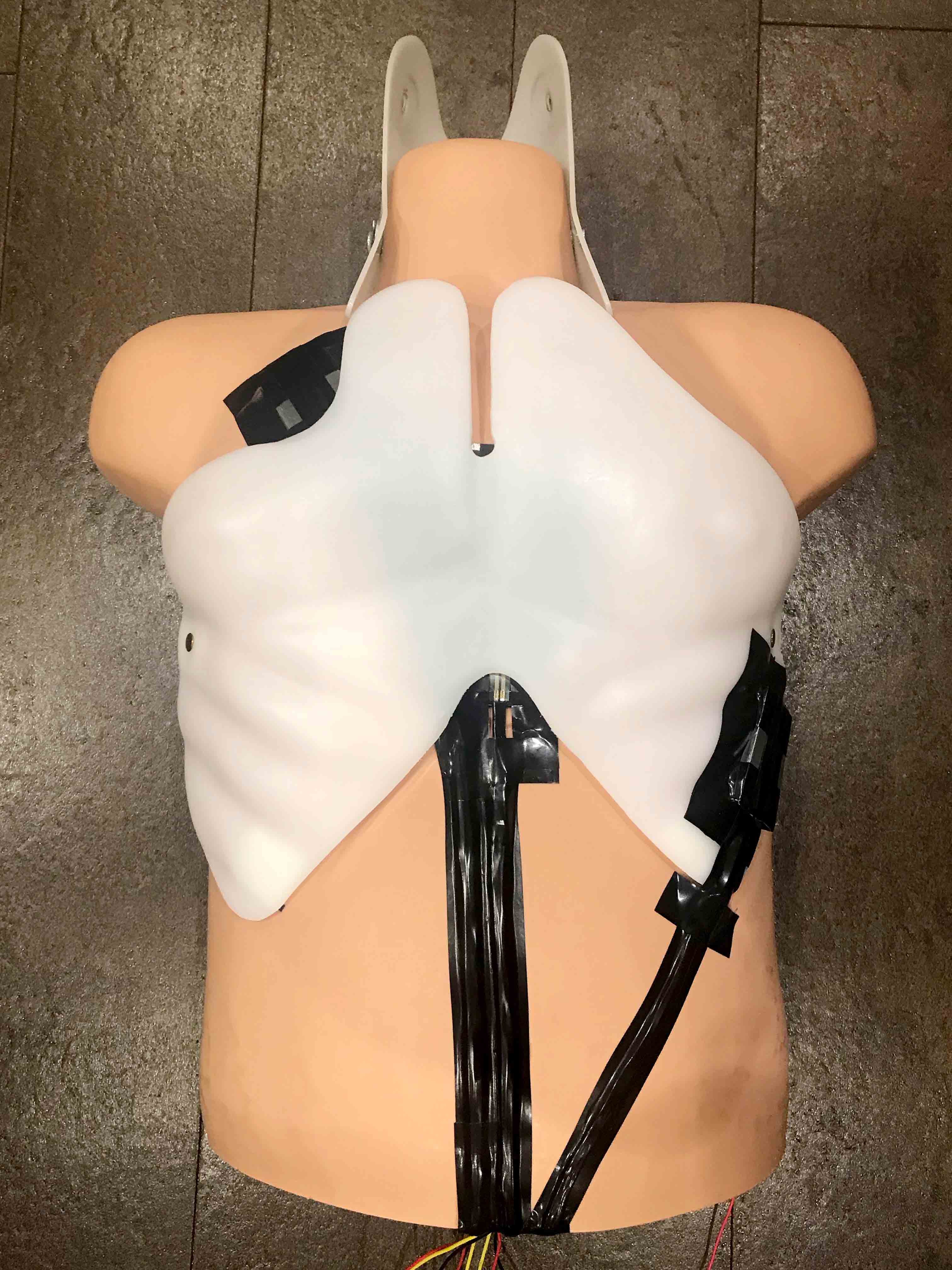
Three stages of embedding the sensors into the manikin, later to be covered by a layer of "skin"
After all the components were taped down, I fed all the wires through the hole in the bottom of the manikin’s outer skin, and pulled the skin up to cover the body. With the skin on, it is nearly impossible to tell that the manikin has been augmented in any way, other than the fifteen wires protruding from the manikin’s underside.
The number of wires involved made it quite difficult to wire the manikin to the Arduino. To make this easier, I switched the manikin’s microcontroller from an Arduino Uno to an Arduino Pro Mini 5V, which accounted for about an 80% reduction in the size of the microcontroller.

Arduino Pro Mini 5V and Arduino Uno size comparison
The layout of the Arduino Pro Mini 5V also allowed me to solder wires directly to the microcontroller, eliminating the need for a breadboard. Complete elimination of the need for a breadboard allowed me to embed all of the wiring and the microcontroller within the manikin. This way, all the “tech” was effectively concealed within the manikin, save for the Arduino Pro Mini 5V’s FTDI breakout board, which serves as the port for the wired connection between the manikin and the computer.
COMBINING THE
DIGITAL AND
THE PHYSICAL
The purpose of the product’s interface is primarily to display the visual feedback on the user’s CPR performance.However, a number of design decisions were made to help users bridge the gap between the manikin as a physical product, and the visualizations and other on-screen elements. For example, by including step-by-step instructions on-screen and directions to interact directly with the manikin, users began to understand that the two were connected. When it came to displaying the feedback visualizations, users then understood how the visual feedback related to their physical interactions with the manikin.
WRITING THE
CONTENT
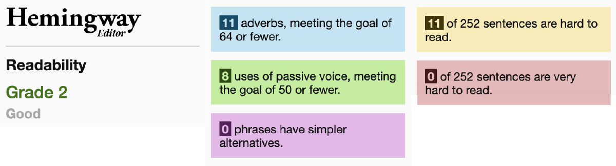
To ensure that the interface’s written content was clear, concise, and actionable, I researched technical writing and employed best practices in my content creation. I also used the online Hemingway Editor app to ensure the ease of readability of my content. This guaranteed that my written content was no greater than a grade 2 reading level.
Hemingway editor results
DESIGNING THE
LIVE FEEDBACK
The technical and raw data outputted from the sensors each frame was very hard to understand and to action without any further clarification.
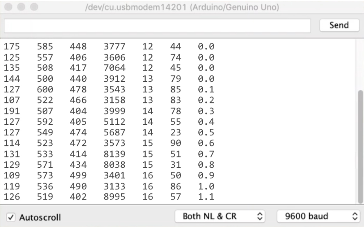
Data outputted from the sensors to the Arduino's serial monitor every frame
As such, I was determined to design the feedback to be highly visual, and as simple and actionable as possible. To help users easily understand the feedback, I designed the feedback so their visuals and colours would mimic other familiar visualizations or items (e.g. dials, balloons) to fit the users’ mental models.
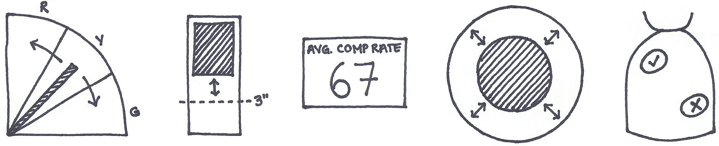
Rough sketches of the feedback visualizations
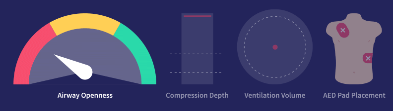
Final feedback visualization designs
DESIGNING
THE UX/UI
In the initial steps of designing the UX and UI, I chose to break out each step of CPR onto its own screen so the user could focus on one step at a time. Before moving into prototyping in Adobe XD, I sketched out some of my concepts as rough wireframes.

Data outputted from the sensors to the Arduino's serial monitor every frame
While I had the right idea on paper, it took several design iterations in Adobe XD for the UI design to get to a place where it looked good, felt intuitive, and where all the necessary information was easily accessible.


A few of many design iterations for the user interface
However, in initial usability testing of this interface, users were overwhelmed by the amount of information displayed on the screen at one time. In an interface that aimed to make learning CPR more effective and engaging, this needed to be changed.
My next design iterations used progressive disclosure to provide information to users one piece at a time, so as not to overwhelm. This design consisted of four half-screen panels navigated by swipe. Each panel would display a different piece of information regarding the step of CPR: (1) the step overview, (2) a simple looping animation, (3) step-by-step instructions, and (4) a helpful tip, way to practise, and/or visual feedback.

Four-panel design iteration. From left to right: (1) step overview, (2) looping animation, (3) step-by-step instructions, (4) way to practice and live feedback.
Because many of these pieces of information relied on each other to communicate a greater message, I implemented a swipe system that would have the user navigate a half-screen at a time. This way, they could see both the step overview and animation at the same time, then the animation and instructions at the same time, and finally the instructions and tip/practice/feedback at the same time.
The inclusion of a looping animation was meant to help the user better understand the content, especially given the sometimes-confusing terminology ofCPR. This way, if they didn’t understand what a certain step entailed, they could quickly gain an understanding by watching the animation.

Some of the looping animations. From left to right: assessing responsiveness, landmarking, providing ventilation.
USABILITY
TESTING
When I was pleased with the way my interface looked, and when I felt that the issue of overwhelming users had been solved, I prepared to test my prototype’s usability with real users. To do this, I created a detailed test plan, including a facilitator script and notetaking form, that would guide my usability sessions.
The goals of this usability testing were to validate whether:
Users understand how to use the manikin
Users understand how to use the interface
Users understand the instructions given
Users understand the feedback they receive
The manikin's technology and fabrication hold up with use
Users benefit and/or learn from using the manikin
Usability testing occurred at this stage of the project because I wanted to ensure that I received any necessary feedback that would warrant major changes before I began to code the application. This way, I could easily make changes to the prototype and continue testing without spending additional time coding, which is a much more time-consuming process.
Overall, six participants participated in the study. Some participants were certified first aiders, some had expired certifications, and some had never learned first aid at all. The test took about thirty minutes for each participant to complete.
The insights gained from these usability sessions can be summarized into three sections of recommendations: (1) user experience design, (2) UI and visual design, and (3) content and copywriting. All recommendations were actioned and amended in the interface, except for two, which were of lower priority than the rest, and which would require a significant effort beyond my capabilities at the time.
CODING THE
INTERFACE
To create a functioning interface, I used P5.js’s P5.serial library to connect to the Arduino’s serial port. This allowed me to access the data outputted by the sensors in a web environment where I could code in P5 (Processing), HTML, CSS, and JavaScript. Having the option to use all of these coding languages provided a lot of versatility and served as a very easy coding environment.
I used P5 to code all the visualizations, using simple shapes like rectangles and ellipses, and setting certain variables to the outputted sensor values to allow for the visualizations to change dynamically based on the user’s interactions with the manikin. All other interface elements were coded in HTML and styled with CSS, with most dynamic changes added with JavaScript.
05
Reflection
SELF-CRITIQUES
If I were to do this project again, I would:
Incorporate different types of feedback including audio and tactile, as well as the ability to see feedback over time.
Add a voiceover feature to better serve those who are auditory learners and those with visual impairments.
Conduct more and more robust usability testing to work out any other usability or experience challenges and to gain metric feedback on the ability of my product to improve first aid education.
LEARNINGS
Conducting substantial research at the beginning stages of the project, as well as throughout, can truly help to elevate a project and ensure that every design decision is backed up by a solid rationale.
When working on a self-guided project, it is important to set boundaries to avoid feature creep, as well as to create a thorough, well-researched schedule and stick to it!
01
Project Details
ROLES
Accessibility
Design Research
Project Management
UX Design
TOOLS
Adobe XD
WCAG Standards
Microsoft Inclusive Design Toolkit

To gain a deeper understanding of some of the key decisions, insights, breakthroughs, and roadblocks my team encountered throughout this project, hover over phrases highlighted in blue and read the thoughts and experiences of each of my team members on this project.
02
Problem
PROBLEM
In metropolitan areas, sidewalks and other pedestrian pathways are not always accessible to everyone. Permanent and temporary obstacles such as sidewalk elevation, sidewalk width, construction, weather conditions, and crowds can affect the ability of those with specific accessibility needs to get to their destinations safely and successfully.
Currently, there are little to no available resources to determine the accessibility of different metropolitan pedestrian routes. Accessibility considerations that are provided often lack thoroughness and are determined by the able-bodied. This lack of information causes many people to rely on accessible transit and other members of their persona network for transportation, ultimately restricting their independence.
GOAL
To ease the difficulty of practical navigation within metropolitan areas by providing pedestrian navigation tailored to those with specific accessibility needs.
03
Solution
SOLUTION
A mobile application that makes the practical navigation of public spaces trouble-free for people of all abilities by providing access to necessary accessibility information.

Some of the designed screens of the Ambler app
TAILORED TO
YOUR NEEDS
Robust pedestrian settings allow users to customize their navigation to their specific accessibility needs, without the use of dehumanizing labels.

Ambler's "Pedestrian Settings" screen
COMMUNITY
SOURCED
Ambler knows that accessibility isn’t “one size fits all.” Its community editing feature allows travellers to warn others about unique or temporary hazards such as closed sidewalks, large crowds, or ice.
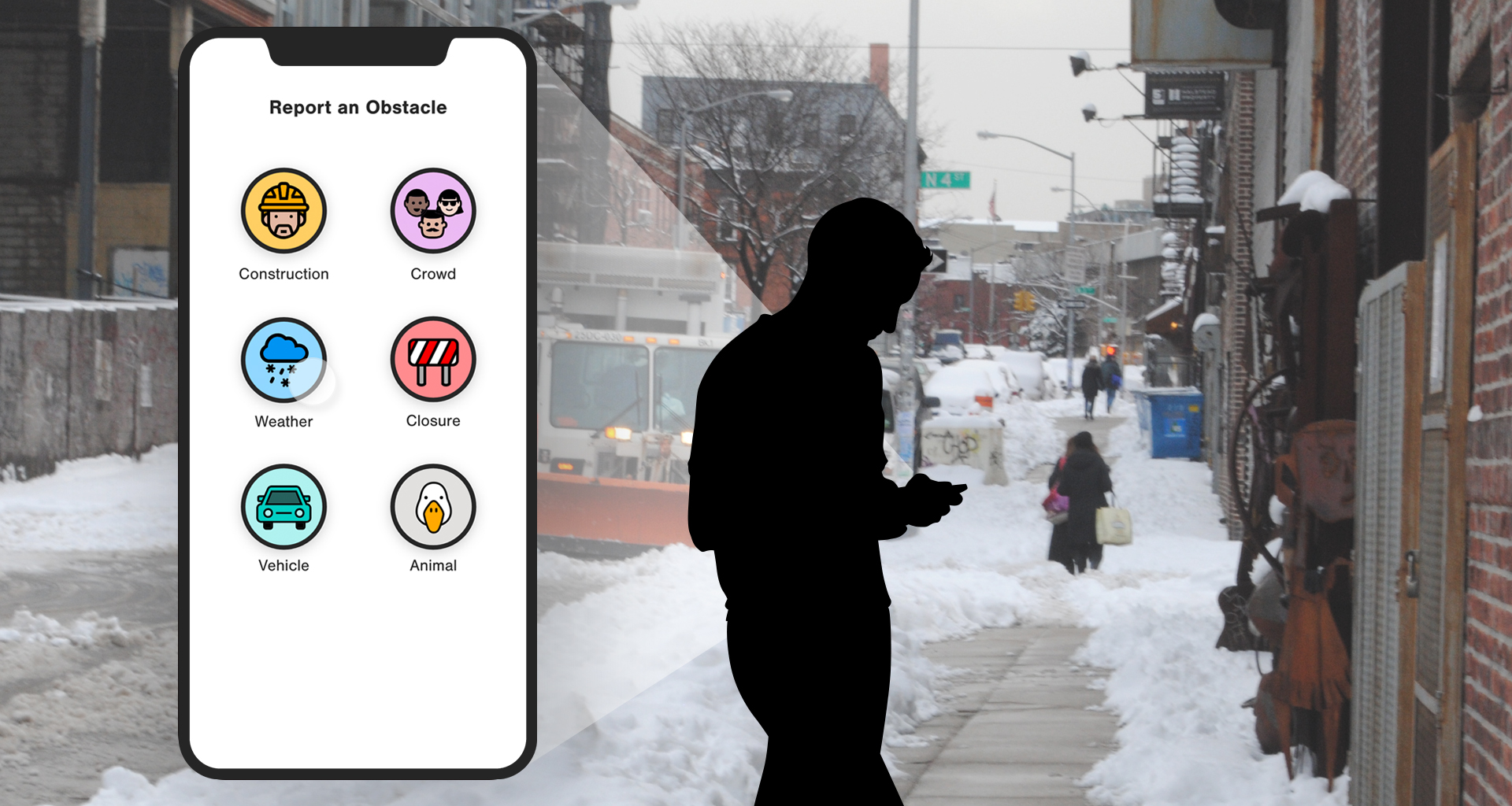
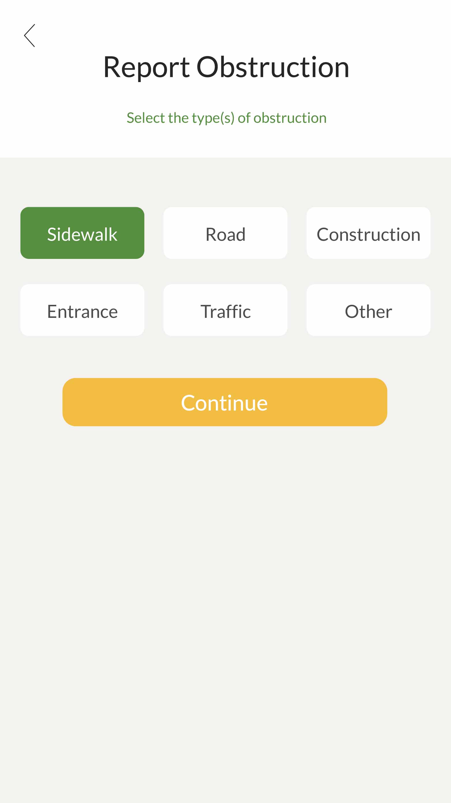
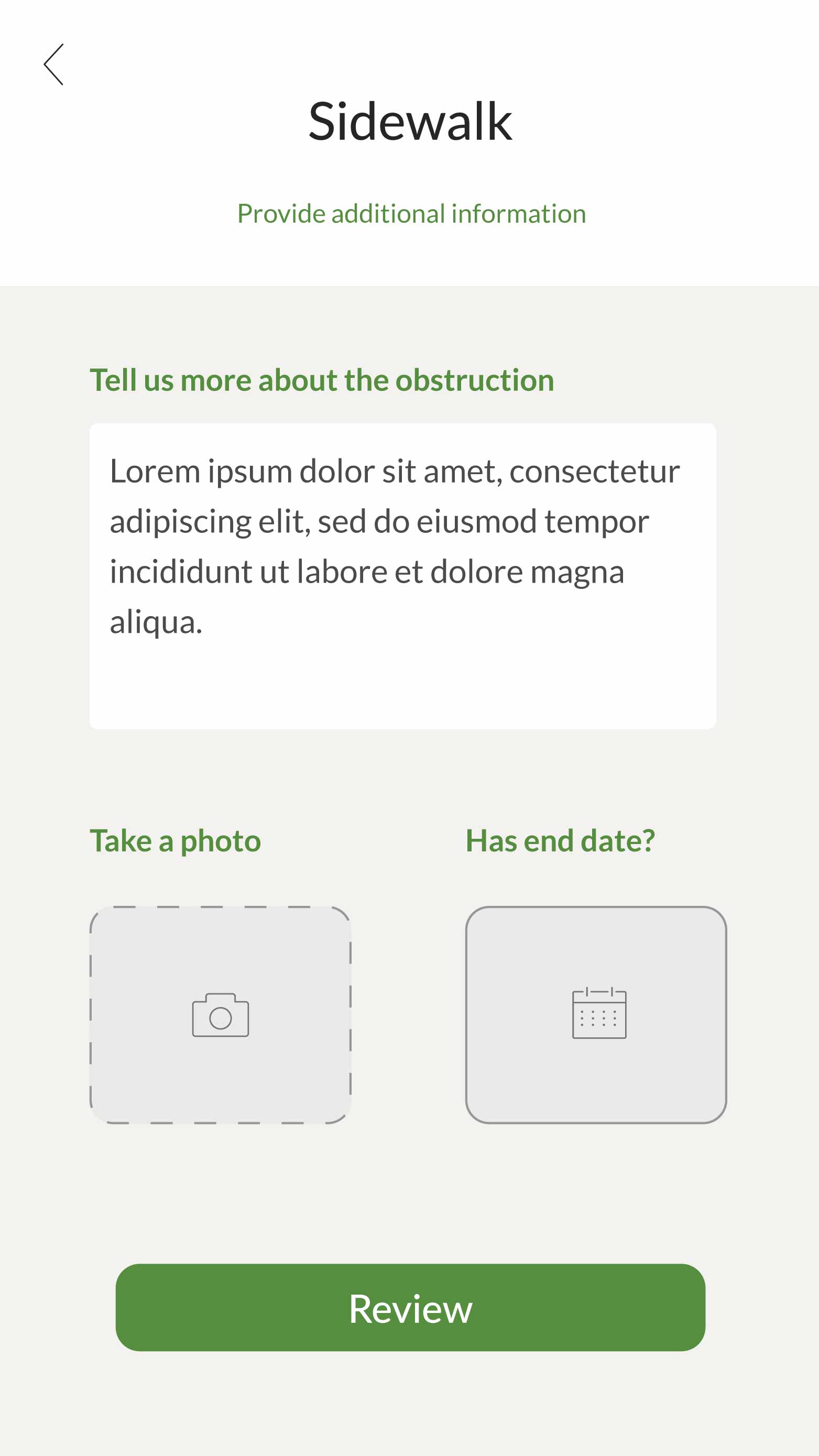
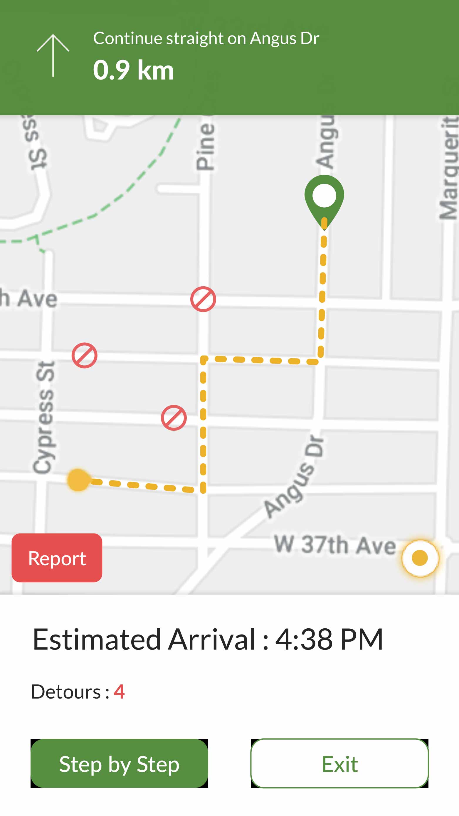
Ambler's "Report an Obstacle" screen
EXPERIENCE-
FOCUSED
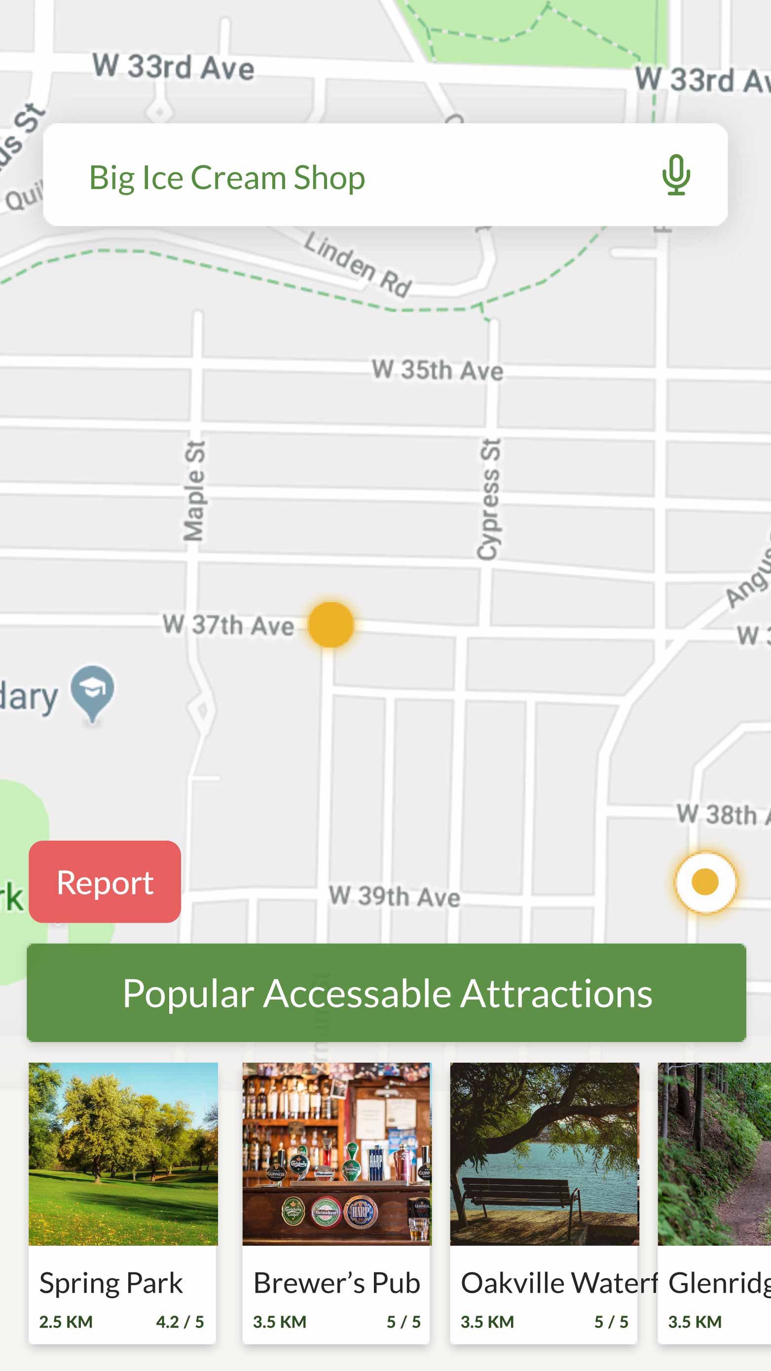
Ambler isn’t just about getting from Point A to Point B, but about enhancing the pedestrian experience along the way. With Ambler, pedestrians can identify and mark the locations of seating areas and accessible restaurants along routes to support others during their navigation.
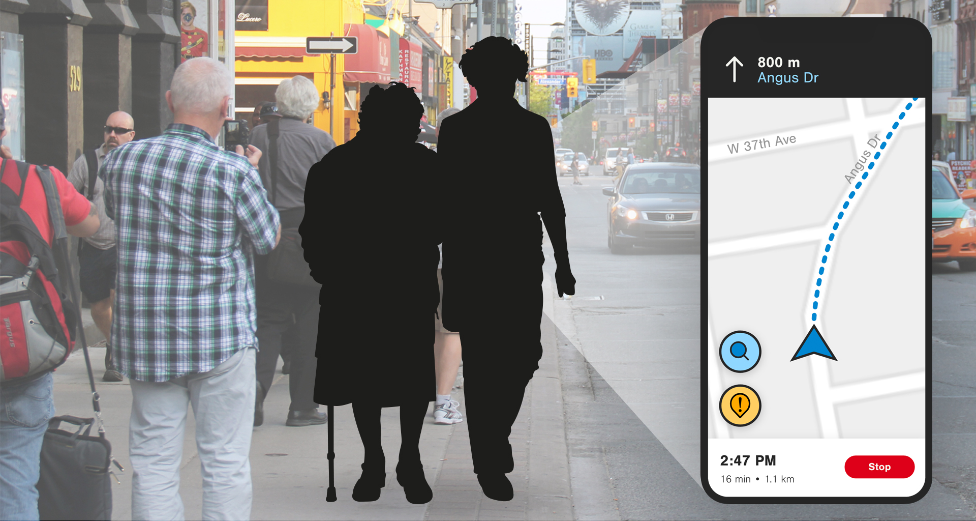
Ambler's "On-Route Navigation" screen
04
Process
THE CLIENT
Ambler was created for the Design Exchange and Government of Ontario’s 7th annual post-secondary design challenge, Boundless. This provincial, post-secondary design challenge seeks to explore design that is accessible to the greatest number of people, to the largest extent possible, regardless of age and ability.
GOALS AND
OBJECTIVES
To ensure that we fully met the intentions of the design challenge, our team started the project by setting goals and objectives that would guide our design, from start to finish. These goals were to:
Gain a deep, qualitative understanding of the pedestrian experience, with a specific focus on those with accessibility needs
Conceptualize a solution that make pedestrian pathways accessible to the greatest number of people
Consider the Design of Public Spaces Standard and the 7 Universal Design Principles in informing our solution
Prototype and test a solution that best addresses pedestrian accessibility needs
PROBLEM
SPACE
At the beginning of the project, we were immediately interested in the problem space of navigation. Our first discussions and concepts surrounded the idea of recreational pathways such as trails and bike paths. However, upon further consideration, we decided that moving to the parallel problem of practical navigation within cities would be more impactful, as it would allow us to help people in their day-to-day lives, rather than just in their recreational activities.
INITIAL
RESEARCH
We validated the significance of this problem through research. In addition to reading articles and blog posts online, we spoke to someone in the persona network of someone with Osteogenesis Imperfecta, whose medical condition affects their ability to travel as a pedestrian. Through this research, we learned about some of the challenges that those with specific accessibility needs face in their day-to-day lives.
RESEARCH
FINDINGS
While able-bodied people may overlook obstacles like the lack of a curb ramp or an interrupted sidewalk, these seemingly-small obstacles can severely impact the travel of pedestrians with accessibility needs. However, there does not currently exist a way to be informed of these obstacles, making them come as a surprise that could cause major disruption or even injury.
ROOT OF THE
PROBLEM
To get to the root of the problem, we engaged in the “5 Whys” activity from the Google Design Sprint Kit. By repeatedly asking “why,” we were able to dive deeper into the problem space to determine the true problem that needed our help.
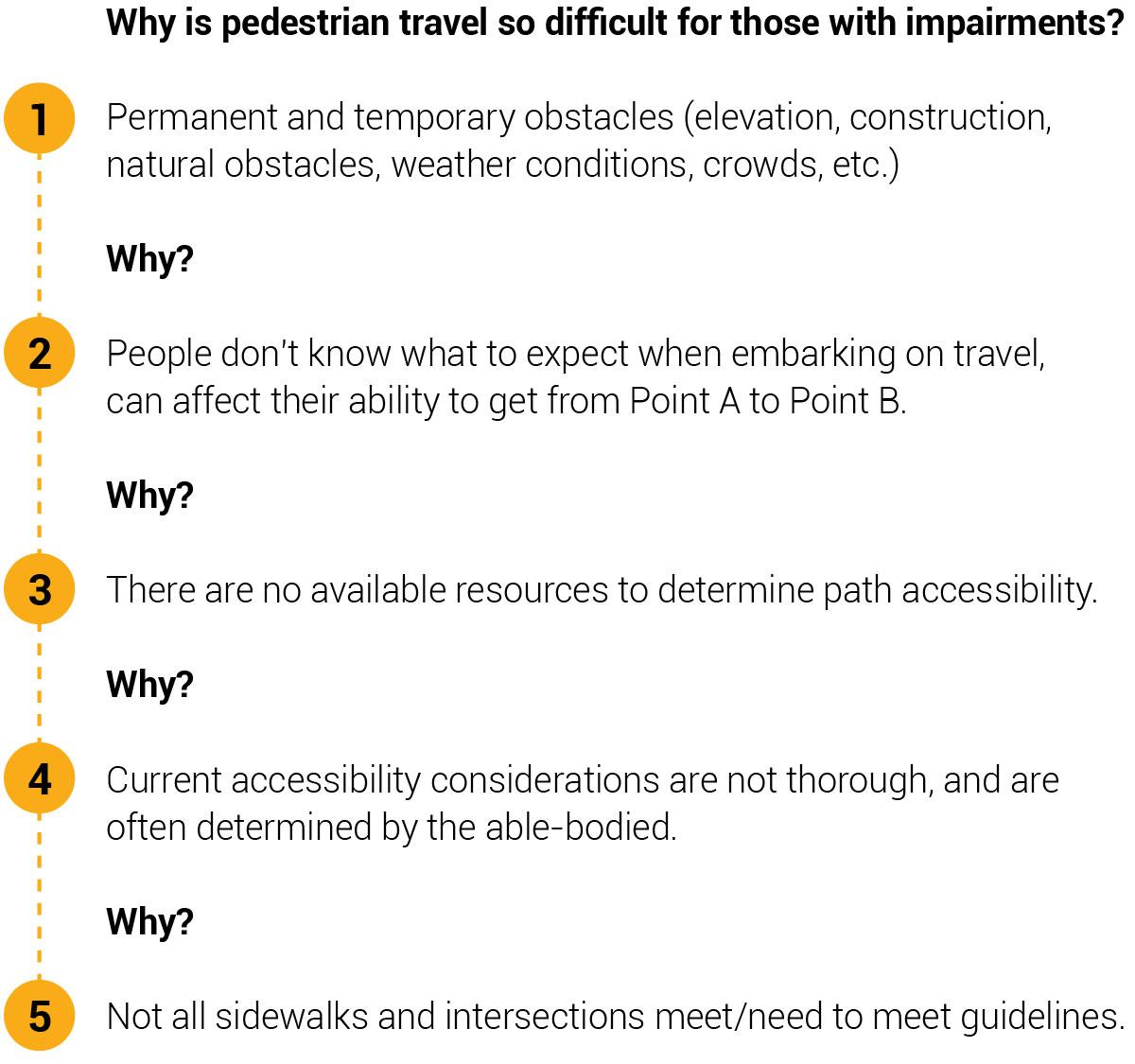
Results of the "5 Whys" exercise
The true problem that we found and wanted to solve was that not all sidewalks and intersections meet or need to meet the accessibility guidelines. However, bringing all pedestrian routes up to accessible standards is a costly and time-consuming process. We wanted to find a solution that could work in the interim to provide relief and support to the people whom this impacts on a regular basis.
COMING UP WITH
THE SOLUTION
It was at this point that we decided to create a tool that would help pedestrians with accessibility needs become informed of obstacles they may face along their routes of travel. After much deliberation, it seemed that a mobile app would be the best medium for this, as it is portable, can easily be made accessible, and can support dynamically-changing information.
COMPETITIVE
ANALYSIS
While many pedestrian navigation apps exist, none focus specifically on pedestrian navigation. We conducted a competitive analysis to validate this and to see how Ambler can differentiate itself from the competition, what its value-add is, and whether it would be able to successfully compete in the market.
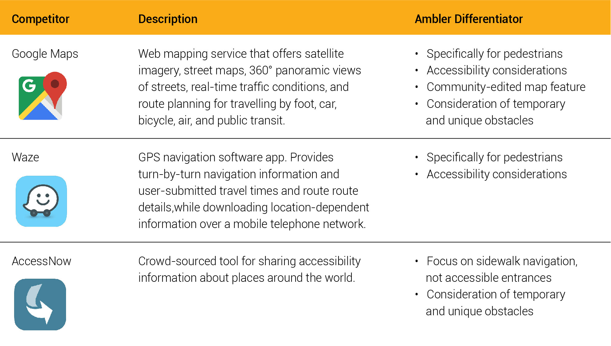
Competitive analysis comparing our concept to existing apps
DESIGN
RESEARCH
To better understand the challenges our target audience faces and potential design requirements of our solution, we conducted research that sought to answer the following questions:
How does city life affect those with accessibility needs?
What are the major recurring pain points our users face?
How does the user journey change based on accessibility needs?
How can Ambler use this information to enhance user experience?
These questions were explored through primary and secondary research, including a popular media search and social media ethnography, and considered the experiences of people with varying accessibility needs. The key insights from this research are visualized below.

Competitive analysis comparing our concept to existing apps
Through this research, a number of specific obstacles were also identified. These obstacles can be divided into two categories: permanent and temporary.
EMOTIONAL
EXPERIENCE
MAPPING
To gain better insight into users’ emotions over time, two types of travel were investigated: (1) interrupted routes and (2) uninterrupted routes. Throughout this research, users’ emotions and dignity throughout their navigation and travel experiences were specifically considered. An emotional experience map was created to help visualize this research.

Emotional experience map comparing interrupted and uninterrupted travel
ACCESSIBLE
DESIGN
Ambler’s visual identity was designed with consideration for visual impairments. The colour scheme and typographical application are WCAG-compliant to allow it to be used by the greatest number of people. In order to ensure that the user does not have to rely on colour alone to distinguish between elements, descriptive visuals are used throughout the design. If this app were to be fully developed for mobile use, we would expand on these considerations by ensuring that the application is able to be read by a screen reader and that any images include alternative text.


Ambler branding including light and dark logo variations, typography, and colour palette, all designed with accessibility in mind
INITIAL
PROTOTYPE
The initial prototype of our app was created in Adobe XD and made into a clickable prototype. This prototype was created specifically for usability testing, and thus did not include the full range of screens, nor was it designed to completeness. Based on the usability test findings, these screens would later be refined.

Initial design of the Ambler prototype
USABILITY
TESTING
Through usability testing, insights were found in four main areas:
Onboarding: The onboarding did little to inform users about the purpose of the app and its core benefits. It also used language that is not inclusive. This was remedied by removing onboarding and replacing it with pedestrian settings, similar to those in Google Maps. This way, the information gathered is about the route requirements and obstacles rather than the individual’s abilities.
Rating System: Users of the app found the trip rating system to be unclear and some users confused it with a “rate the app” popup. This feature was removed entirely, as rating the trip did not contribute to the core functionality of the app and added an unnecessary step for users.
Iconography: Usability testing indicated that icons seen in the app’s onboarding should be used in the navigation screens as well to indicate obstacles. This would help to ensure both consistency as well as “at-a-glance” information. In the refined prototype, iconography was applied more intentionally to provide a clearer understanding of the information presented.
Obstacles: Users should be able to view detailed information about the obstacles and to dismiss obstacles that do not apply to them. In the refined prototype, enabling users to customize which obstacles they wish to avoid in their pedestrian settings eliminated the need to dismiss obstacles. However, more obstacle details were implemented in to the final design.
Final design of the Ambler prototype
05
Reflection
SELF-CRITIQUES
If I were to do this project again, I would:
Create a more robust app prototype and conduct more usability testing with a wider range of participants to gain even more insights on the app’s usability and user experience.
Conduct more research into accessible app design and further refine the app prototype to be even more accessible to a greater number of people.
LEARNINGS
Accessibility comes in many forms, including permanent, temporary, and situational accessibility needs. It is not only important to consider those with accessibility needs themselves, but also to consider their persona networks, including friends, family, caregivers, and service animals.
When designing for accessibility, it is critical to be inclusive of the widest range of users and to consider things from the perspective of others, as it is easy to overlook items that aren’t problematic for the able-bodied.
Designing for accessibility should not be an afterthought in the design of any product. Rather, the product should be designed around the central theme of accessibility.
01
Project Details
ROLES
Interaction Design
Physical Computing
User Experience
Visual Design
Web Design
TOOLS
Arduino
Audio Editing
Fabrication
HTML & CSS
Research
COLLABORATORS
02
Problem
PROBLEM
Suicide is a growing problem among Canadian post-secondary students, with 13% of students reporting serious consideration of suicide. However, suicide is not unpreventable.
GOAL
To motivate post-secondary students to talk more openly about suicide, creating a community that is more suicide-alert and understanding of how to help someone in distress.
03
Solution
SOLUTION
An interactive social change campaign that employs a website, narrative, and interactive poster to reach and educate post-secondary students about suicide alertness and prevention.
WEBSITE
The website (currently only a landing page) serves as the campaign's main source of information and resources, both for students who want to help others and for students who are in distress themselves. The website aims to motivate people by informing and educating them through factual information from credible sources.
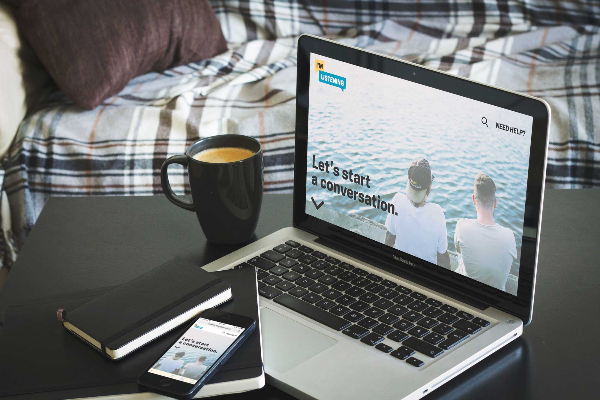
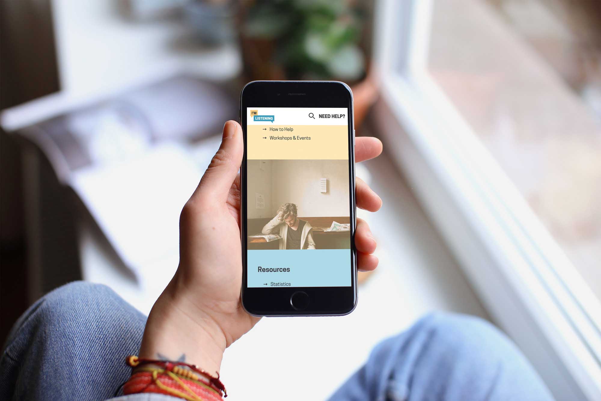
The "I'm Listening" website on desktop and mobile (view the site here)
NARRATIVE
The poster's narrative is told through the voices of the characters in the photos. Each character tells their own story of how suicide has affected them.
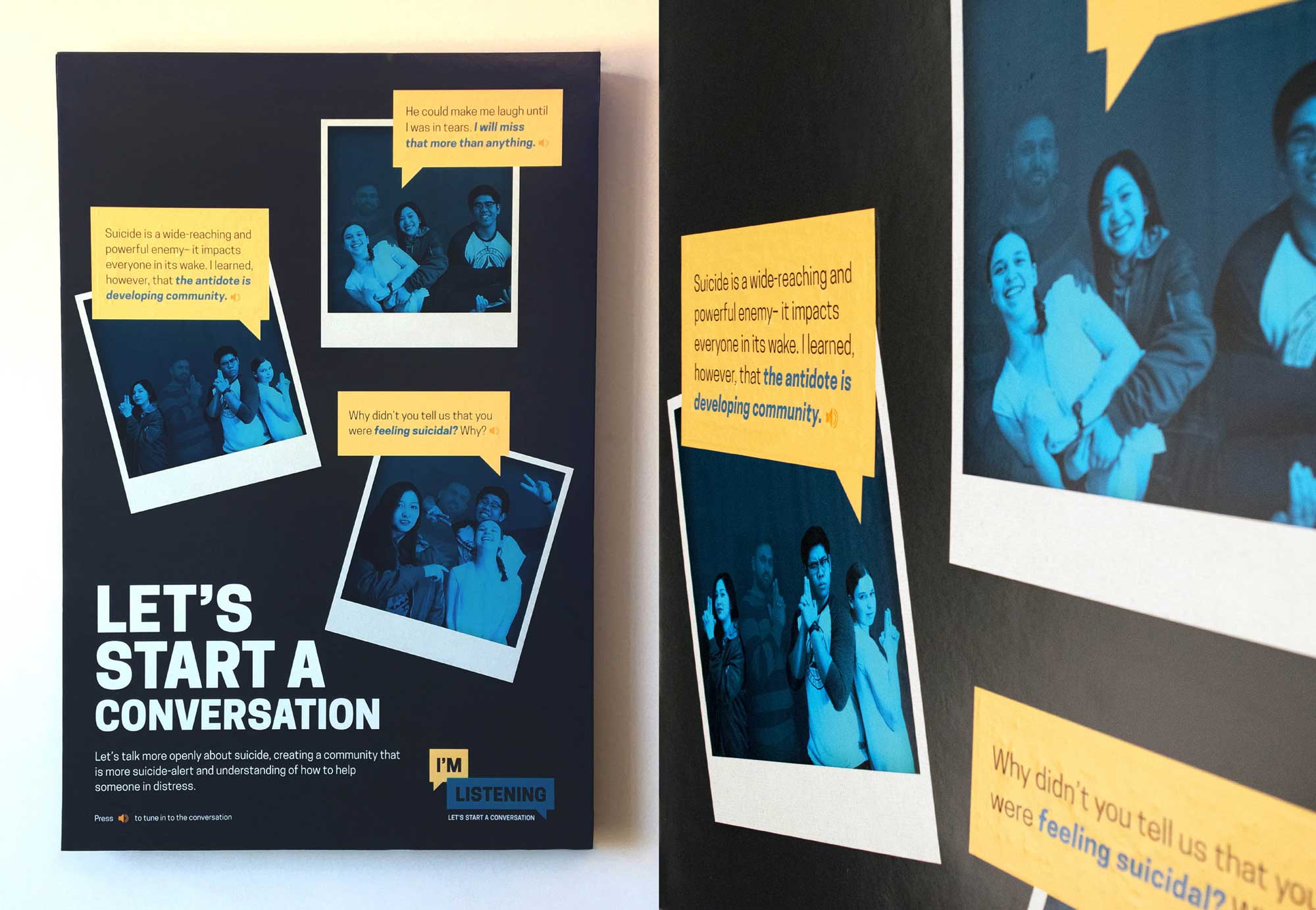
The interactive poster
INTERACTIVITY
The poster's interactivity allows for direct physical interaction with its target audience. This interaction helps audience members understand the importance of our cause and of dialogue on this project.
Demonstration of the interactive poster in use
04
Process
SECONDARY
RESEARCH
The design process for this project began with research. Creating a successful campaign that would inform and educate its audience was dependent on a basis of accurate information. Research sources included news articles, research studies, and content from LivingWorks' safeTALK suicide alertness training program.
EXPERT
INTERVIEWS
To better understand the problem space and to inform the direction of our social change campaign, we conducted interviews with post-secondary mental health professionals. Given the sensitive nature of our campaign, it was especially important to consult professionals and be wary of our sources of information. We asked these experts about their experiences with post-secondary mental health, how their training has helped them, and how it can help others. Specifically, we wanted to understand what post-secondary students can do to help their peers who may find themselves in crisis.
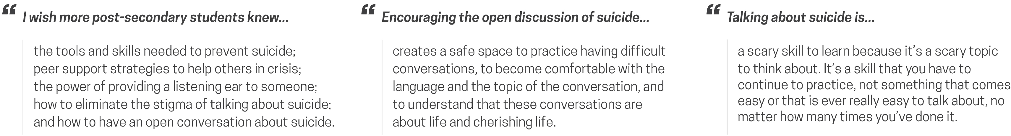
Quotes from interviews with post-secondary mental health professionals
EMPATHY
MAPPING
To help us empathize with our users, we enlisted the help of post-secondary students and professionals to discuss the daily experiences of post-secondary students in relation to mental health. We created an empathy map to visualize our empathetic understanding of our user base.

Empathy map considering the post-secondary student experience
EXPERIENCE
MAPPING
We used the above research to inform the specific tone and subject matter of our social change campaign.Because our campaign deals with two types of post-secondary users, each with their own experience, we visualized an experience map that incorporated both types of users. This map served as a guide when creating additional campaign elements, and was something to which we referred when making design decisions throughout the design process.
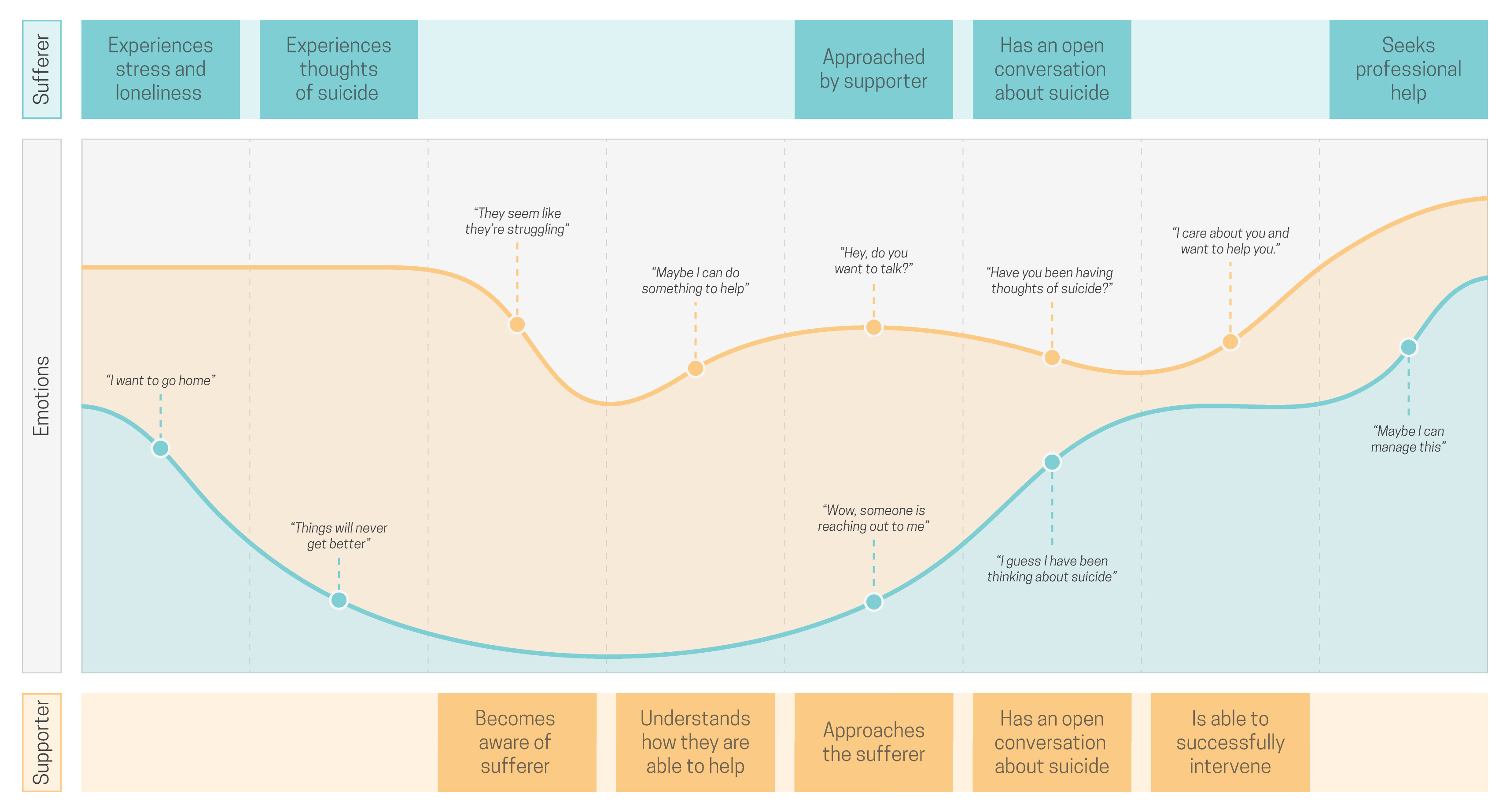
Experience map considering the perspectives of both a suffering student and a student offering support
LOGO
When designing a logo, we focused on imagery relating to conversations or to listening. We settled on chat bubbles not only because they are associated with conversation, but also because they are widely used in chat programs, which post-secondary students rely on heavily for communication.

Logo concepts and iterations, experimenting with different names
COLOUR
When exploring colour palette options, we used colour psychology to determine the most impactful colours for the branding. The combination of the cool, trustworthy, and soothing blues with the optimistic, confident yellows was the final choice to capture and emphasize the tone of the campaign.

#3D9DBC
#7CCED5
#FCCB7F
#FFE7B9
#404041
TYPOGRAPHY
For the typography, Cooper Hewitt was chosen because it has a wide variety of weights, it is sans serif, which is cleaner and trendier by nature, and also because it is not a typical choice for a sans serif font, as it is slightly narrower.


Cooper Hewitt Heavy
Cooper Hewitt Semibold Italic
Cooper Hewitt Book
WEB DESIGN
The layout for our landing page was designed with the user needs in mind. We figured that most visitors to our site would be looking for important, time-sensitive information, so we prioritized the links that would be most useful in an emergency situation. Most importantly, the "Need Help" link in the fixed header allows users in crisis to quickly find the help they need.

Website wireframe
MOBILE READY
The website is optimized for web as well as mobile use, in both portrait and landscape modes. These different layouts were achieved using media queries in CSS, which allow content to be styled differently based on the size of the device's viewport or screen.
Mobile site layout
POSTER DESIGN
The final poster idea was conceptualized when we thought about how suicide touches the people close to someone who died by suicide. We thought that evoking an emotional response would be the most appropriate path. Originally, we were going to use separate photos of each character in the narrative, but we decided that using group photos highlighting a fun time in a student's life would be a better way to capture the viewer's attention.

Poster concept sketches
PHOTOGRAPHY
Since we crafted the concept of our poster to follow a specific narrative, we had to take our own photos for the poster. We treated our photos to match our brand, using blur and grey to create a duotone effect. We then lowered the opacity of one of our models to communicate that they had died by suicide, consistent with our poster's concept. By treating the images this way, we hoped to evoke a feeling of nostalgia in viewers.


Original photos
Edited photos
AUDIO
Because our poster deals with something so important and personal, we wanted our characters' words to be informed by the actual words of people who experienced losing someone to suicide. We used The Dialogue Projects as a reference for these excerpts. We then sourced voice actors to read the clips. Audio editing was done in Adobe Audition to eliminate echo and white noise.
CIRCUITRY
Making the poster work required the use of an mp3 shield and capacitive touch sensor attached to an Arduino Uno. The mp3 shield holds an SD card containing our audio files, while the capacitive touch sensor allows us to trigger actions through touch. Wires run out of the capacitive touch sensor to areas of conductive paint, creating a conductive touch-triggered area customized to our desired shape and size. Each audio file plays through attached speakers when its corresponding area on the poster is touched. The Arduino, speakers, and wires are housed on the back of the poster.

The circuit, housed on the back of the poster
05
Reflection
SELF-CRITIQUES
If I were to do this project again, I would:
Shorten the audio clips, as they are too long for a viewer's attention span.
Make the interactivity of the poster more obvious so users know that they can interact with the poster.
LEARNINGS
Narrative is crucial in design work. Refining your narrative and finding the proper way to tell it is paramount.
Evoking emotion is a powerful goal that must be attempted with care.
01
Project Details
ROLES
Interaction Design
User Experience
User Research
Visual Design
TOOLS
Adobe XD
Personas
Research
Wireframes
COLLABORATORS
None
02
Problem
PROBLEM
Existing fitness-, sleep-, and nutrition-tracking wearables and their existing apps are not truly conducive to encouraging health and wellbeing in their users. While there are many different activity-tracking products on the market, each product has some of the relevant features, but no one product has them all.
GOAL
To help people achieve their fitness goals through smarter fitness-, sleep-, and nutrition-tracking to promote the adoption of a healthy lifestyle.
03
Solution
SOLUTION
A new activity-tracking app (to accompany a wearable device) that uses robust preference settings and AI to provide a personalized experience to best help its users achieve their health and wellness goals.
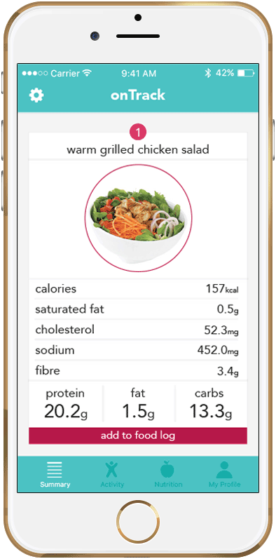
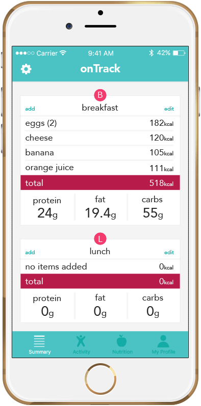

Add restaurant items screen
Daily food log screen
Daily summary screen
RESTAURANT ITEMS
Restaurant menu integration helps users stay on top of their nutrition goals without compromising on their existing lifestyle.
MACRONUTRIENTS
Users can see their daily fat, protein, and carbohydrate intake directly in the food log for a convenient, at-a-glance overview.
THREE TYPES OF TRACKING
Activity-, nutrition-, and sleep-tracking all exist in one space, to help users achieve more while doing less.
04
Process
USER RESEARCH
To best understand the app's users, I conducted primary research through an anonymous survey that asked questions about subjects' values, knowledge of fitness, and internet use, among other things. I plotted each user on a scale by giving them an ID letter so I could easily see any patterns or trends emerging.
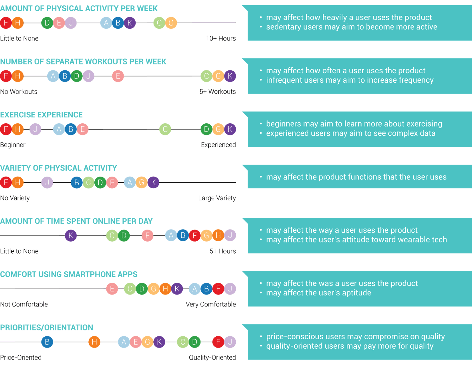
User survey answers, plotted on a scale
BEHAVIOURAL PATTERNS
I then considered behavioural patterns based on the research I had previously conducted. Looking at the research gathered, I was able to make informed assumptions about some of the users and how their values, knowledge of fitness, and internet use would affect how they would use a smartphone app such as mine.
PERSONAS
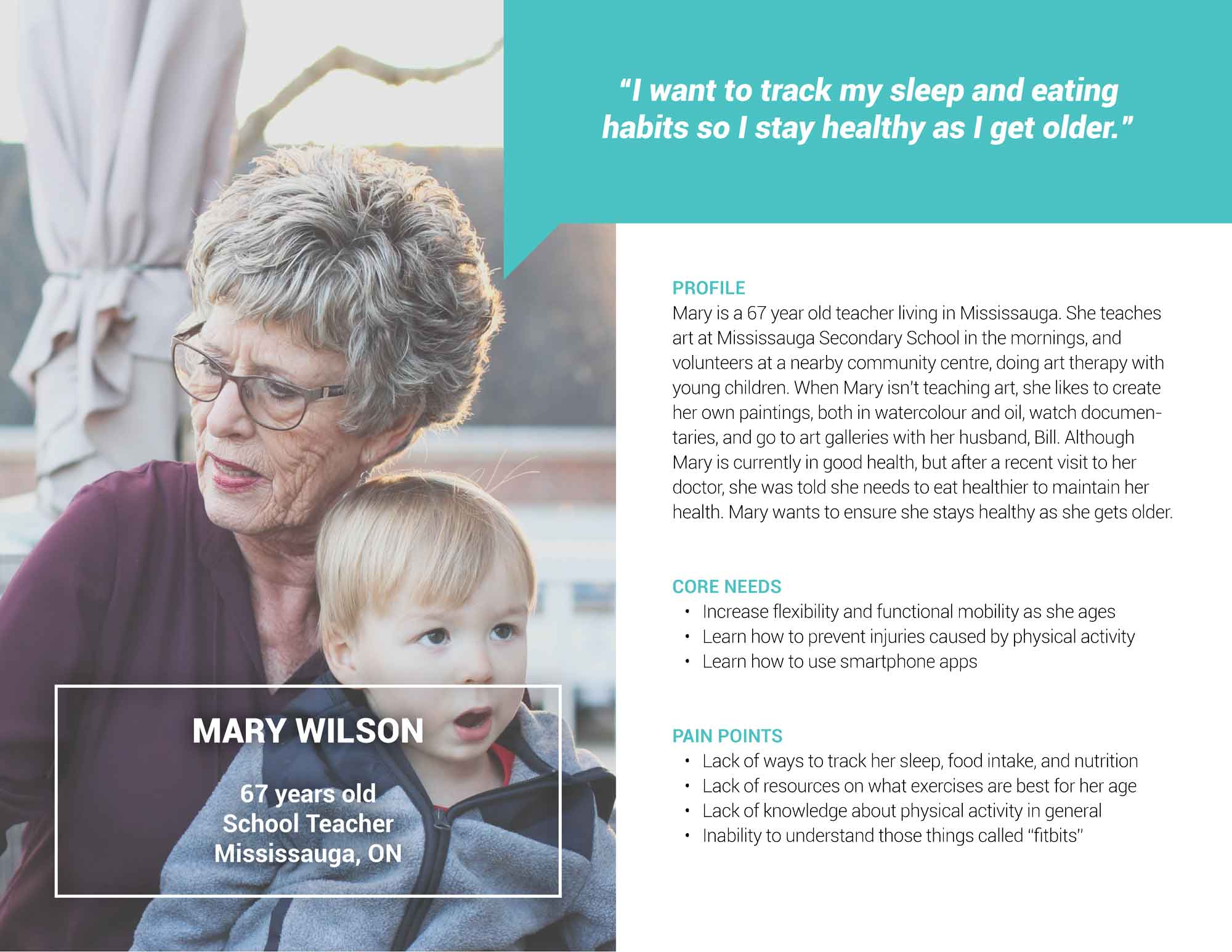
Using my research and behavioural patterns as a guide, I created three personas that reflected my users.


CONTEXT SCENARIOS
Once the personas were made, I created context scenarios, a series of scenarios that might occur in a typical day of using my app. These context scenarios were created with my primary persona, Alice, in mind as the user.

Context scenarios created for the persona of Alice
DESIGN REQUIREMENTS
Using the previously created context scenarios as a guide, I was able to flesh out the design requirements, which consist of functional requirements, data requirements, and contextual requirements. This type of information would be given to developers to help their understanding of the app and its technical needs.
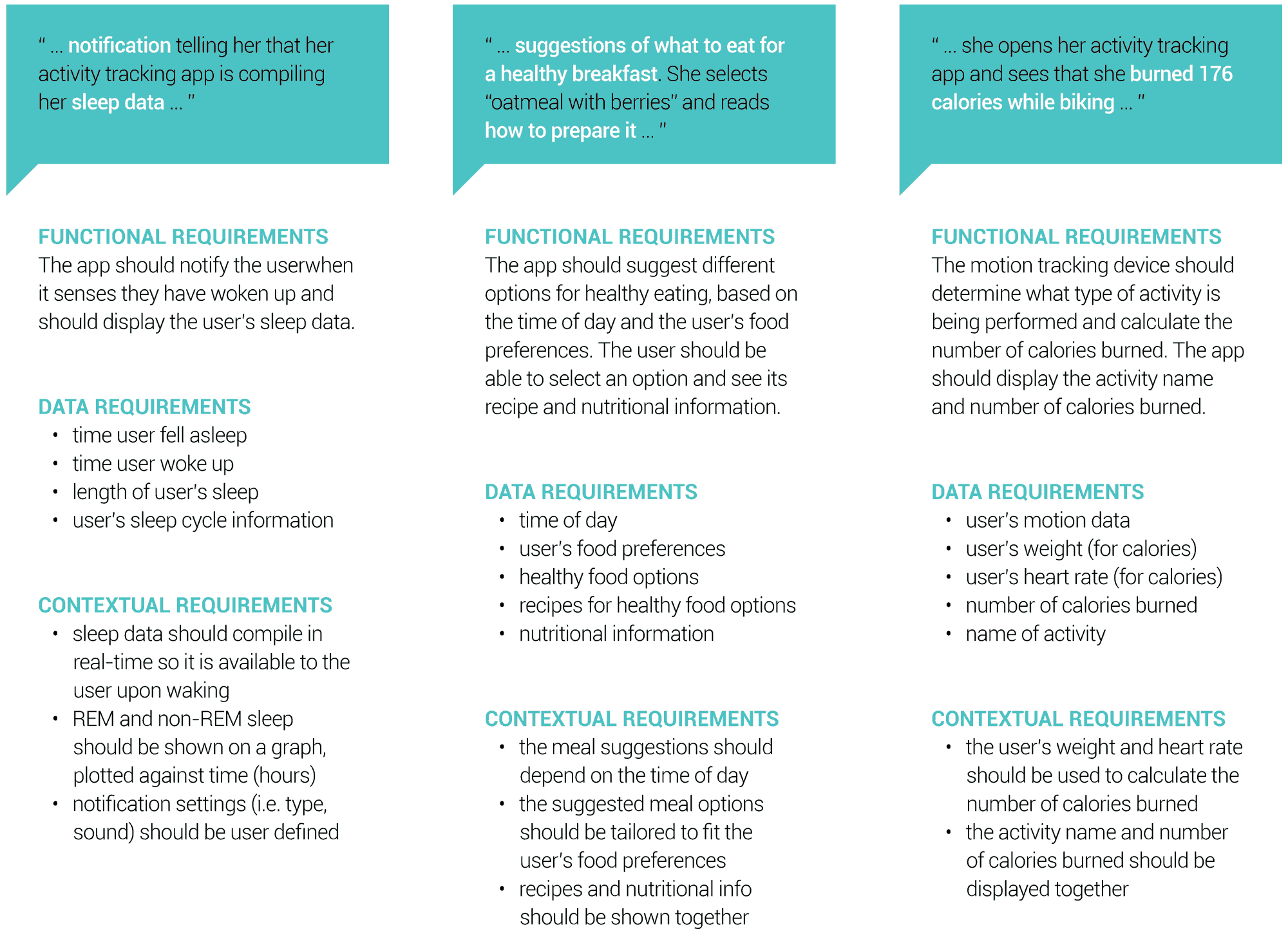
Some design requirements based on the context scenarios
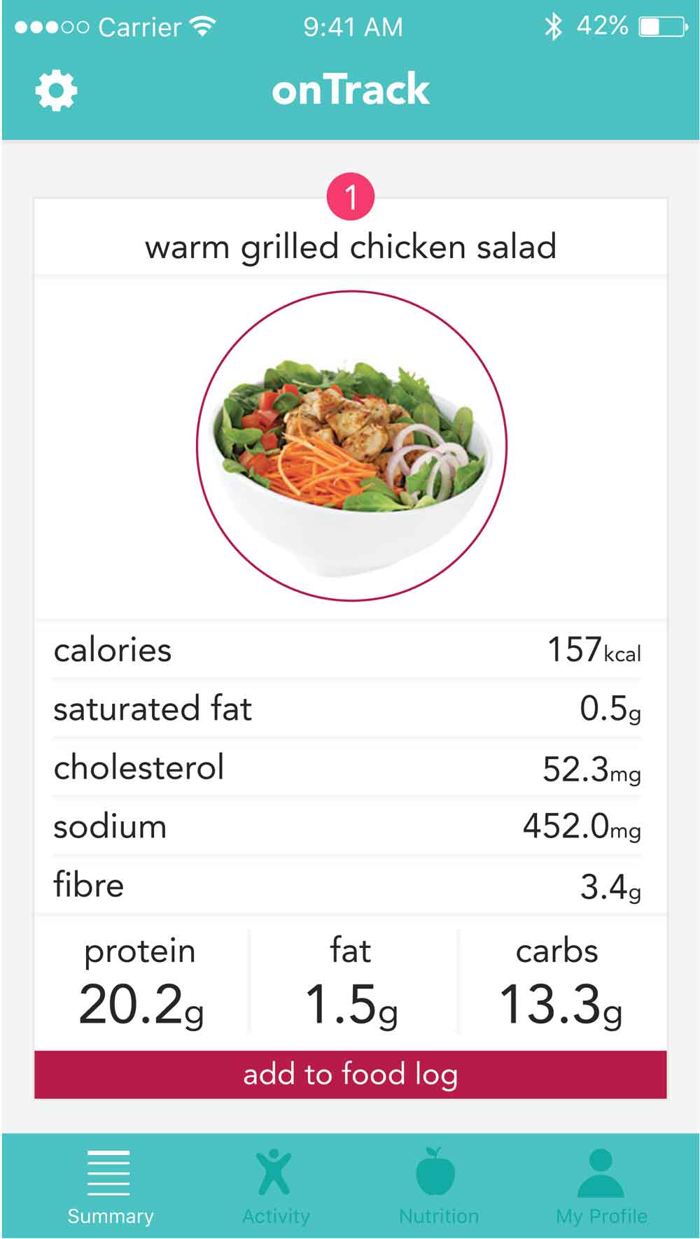
WIREFRAMES
Once all the technical specifications and requirements had been determined, I began to design the app's interface. I began doing this with wireframes before finalizing the design. The wireframes I created show the screens needed to complete a specific task within the app. In this case, the task was adding a restaurant menu item to the food log. I also took into account the user's interactions to move between screens.


Wireframe screens (scroll right)
FINAL INTERFACE
Although it was beyond the scope of this project to conduct user testing, I received feedback on the wireframes from my peers, and implemented changes before designing the final interface.


Final interface screens (scroll right)
05
Reflection
SELF-CRITIQUES
If I were to do this project again, I would:
Find time to conduct user testing before finalizing the design of the app.
Conduct even more user research, including interviews, to truly understand the users in their diversity.
LEARNINGS
While it is easy to think of a design idea for an app, there is so much more involved, from user research to context scenarios to design requirements. Going through these steps not only helps improve the final design, but helps the designer flesh out the idea in its entirety before making important design and usability decisions.
01
Project Details
ROLES
Interaction Design
Physical Computing
Usability Testing
TOOLS
Arduino
Fabrication
Processing
COLLABORATORS
02
Problem
PROBLEM
The Canadian Association of the Deaf estimates that there are approximately 357,000 profoundly deaf Canadians, and 3.21 million hard-of-hearing Canadians. Hearing impairment has been associated with lower quality of life by way of social isolation, depression, safety issues, mobility limitations, and reduced income and employment.
GOAL
To encourage empathy, understanding, and inclusivity of those with hearing impairments and to pave the way for acceptance on a greater scale.
03
Solution
SOLUTION
An interactive tool to help children (and adults) learn the American Sign Language (ASL) alphabet, with a long-term goal to be implemented on a large scale to encourage the widespread understanding of deaf culture and communication.
Demonstration of the glove and interface in use
ARTFUL FABRICATION
The ASL Glove is crafted with care, making it robust, colourful, and easy and comfortable to wear.

The finished ASL glove
GAMIFICATION
The game-like program makes the learning process more exciting and enjoyable, and almost invisible, especially for children.
Game-like user interface
04
Process
SECONDARY
RESEARCH
Before coming up with a solution to our problem and a way to achieve our goal, we conducted research to help us better understand the problem space. To better understand how people are affected by hearing impairments from a social science perspective, we consulted a number of scholarly articles. We created a flow chart to help us synthesize and visualize the insights gained from this research.

Secondary research synthesized and visualized in a flow chart
EMPATHY
MAPPING
To help us understand the personal and day-to-day challenges of our users, we conducted in-depth reviews of personal stories and case studies of the hearing impaired and their family and friends. We created an empathy map to visualize our empathetic understanding of our user base.

Empathy map for those with hearing impairments
KEY INSIGHTS
Through this research, we derived a number of key insights that helped inform our solution:
American sign language consists of thousands of signs that are conveyed through a combination of hand gestures, facial expressions, and body language
Existing sign language translation tools have failed to capture the nature of ASL, and although they are presented as devices to improve accessibility, they ultimately serve hearing people rather that those with hearing impairments
Improving quality of life for those with hearing impairments should focus not on how those with hearing impairments can make it easier for the hearing to understand them, but instead on how the hearing can have a basic understanding of deaf culture and communication
SWOT ANALYSIS
Finally, once we felt we understood the problem space, we began to brainstorm possible solutions. We created SWOT analyses of our top two ideas (translation device and interactive learning tool) to determine which would be the more effective and meaningful solution. Eventually, we settled on the interactive learning tool.
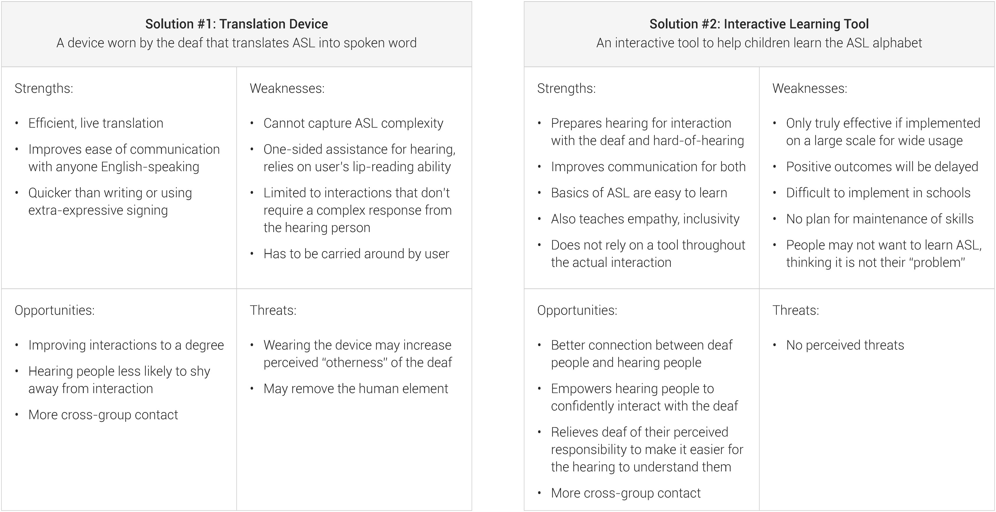
SWOT analyses of our top two solution ideas, created to help us choose one
CIRCUITRY
The ASL Glove uses one flex sensor per finger, connected to an Arduino Uno. These flex sensors output a resistance value to the Arduino's serial port. As the flex sensors are bent, their outputted resistance values change. By reading the values of each of the five sensors, we can determine which fingers are bent and to what degree. In order to make this technology wearable, we confined our wiring to a mini breadboard to keep the size down.

Wiring on the mini breadboard, with toonie for size comparison
FABRICATION
When designing the glove, we realized that as a user bends their fingers, the flex sensors would have to be able to slide up and down along the finger. Because of this, we had to attach the sensors to the glove in a way that would allow them to slide. To do this, we attached each sensor with thread to the tip of each finger, and then sewed down the length of the sensor, creating loops. These loops were sewn loose enough that the sensor can freely slide within them, but tight enough that the bend of the sensor remains true to the bend of the finger. We used coloured thread, not only to improve the glove's aesthetics, but also to increase usability, in that we could match the colours to those in the illustrations that would later be used in the program interface.
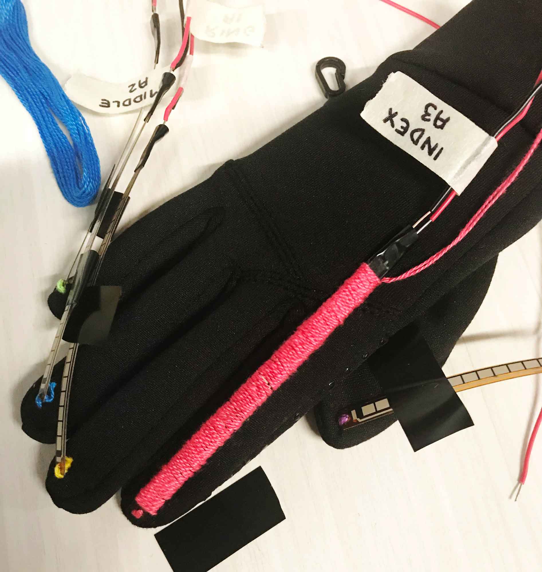
The first flex sensor fully sewn in on the index finger
DATA COLLECTION
For the program to know when a letter was being signed correctly by the user, we had to test the glove with each letter of the alphabet several times. Additionally, we had to conduct this testing with several users, as we knew the sensors would bend differently based on the size of the user's hand. When testing each letter of the alphabet, we recorded the resistance values outputted by the sensors, then created a range for every finger for each letter. This allowed the program to recognize when each finger was in the right position for any given letter, regardless of variations among users.
if (letterPicked == "A") {
if (flexR_THUMB > 12000 && flexR_THUMB < 26000 &&
flexR_INDEX > 27958 && flexR_INDEX < 43000 &&
flexR_MIDDLE > 26035 && flexR_MIDDLE < 41650 &&
flexR_RING > 16492 && flexR_RING < 26000 &&
flexR_PINKY > 37528 && flexR_PINKY < 55000) {
return true;
} else {
return false;
}
Code to check if the letter A is being signed correctly
USER TESTING
Although most of our user tests used college students in their 20s, we also tested the program on octogenarians, who may have different physiology (e.g. arthritis), cognitive skills, and reaction times. The tests were successful, but the 10-second time limit that the program imposes on users to successfully sign a letter proved challenging for these older users, and can be modified if necessary.
CODING THE PROGRAM
The program we created for the glove was built in Processing. This is because Processing has the ability to communicate with the Arduino's serial port, allowing it to receive values from the flex sensors. To make the program game-like, we had it choose a random letter and display both the English letter and the ASL hand position. The program then gives the user 10 seconds to properly demonstrate this letter. If the user succeeds, the program provides the user with positive feedback in the form of a green screen with a check mark. If the user cannot correctly demonstrate the letter within 10 seconds, the program provides the user with negative feedback in the form of a red screen with an X. The program then chooses a new random letter and displays it on the screen.
if (serial != null) {
float[] array = float(split(serial, ','));
thumb = array[0];
index = array[1];
middle = array[2];
ring = array[3];
pinky = array[4];
}
if (checkLetter(letter, thumb, index, middle, ring, pinky) == true && quit == false) {
image(correct, 0, 0, 1280, 950);
quit = true;
correctTimer.start();
} else if (timer.isFinished() && quit = false) {
image(incorrect, 0, 0, 1280, 950);
quit = true;
correctTime.start();
}
if (correctTimer.threeIsFinished() && quit == true) {
startOver();
}
Code that runs every frame to read the information from the serial port, check if the letter is being signed correctly, handle the 10-second timer, display the green or red screen, and tell the program to start again
THE INTERFACE
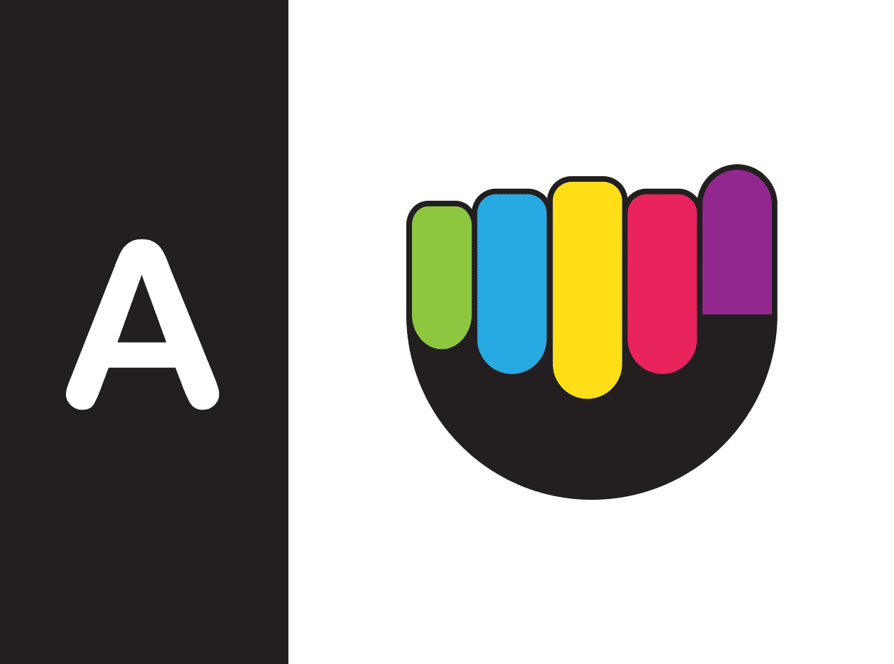
We designed the user interface to be very simple, bright, and easy to follow, which makes the program fun and usable for children. The ASL illustrations have colour-coded fingers that afford to the user that they are supposed to match their hand position to that which is shown on the screen. The colour-coding also helps the user to correctly make the hand position by visually connecting what finger goes where.


Screen showing which letter to make and how
Positive and negative feedback screens
05
Reflection
FUTURE OPPORTUNITIES
Now that this prototype has been successfully created and works well, we would be very interested in exploring the idea of accessibility for the deaf and hard-of-hearing thorough the use of ASL Gloves. For example, it may be possible and within our scope to create a pair of gloves that can recognize full ASL words. Hopefully we will find the time and resources to experiment with more advanced tools in the future and make this dream become a reality!
LEARNINGS
Even when creating a prototype, careful fabrication is very important. The better fabricated the prototype, the more accurate it will be to any final design.
Even when you think your idea has been finalized, stay open to other ideas, iterations, and options. Little changes to design can make a big difference in the success of the project and open new opportunities and applications.

